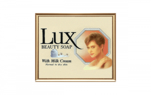
Lux is a toilet soap brand owned by Unilever. The history of the brand started as long ago as in 1899. It was created by the company Lever Brothers, which is now operating as Unilever. While the original name of the product was Sunlight Flakes, it got its current name in 1900.
Meaning and history
The Lux logo has been centered on the name of the brand and, typically, hasn’t included pictorial elements. This is not to say it has remained the same through the years – vice versa, the typography has seen more than one complete overhaul.
Early 1920s
The company has always gone to great lengths to gain celebrity endorsements. The list of the actresses that have been brand spokeswomen includes Audrey Hepburn, Deanna Durbin, Kim Novak, Brigitte Bardot, and Sophia Loren, to name just a few.
What is Lux
One of the world’s oldest toilet soap brands, Lux is marketed by the UK consumer goods company Unilever. In addition to the soap, products under this brand have been sold in other forms, such as handwash, shower gel, and cream bath soap.
It’s now hard to track what the package exactly looked like during the first decades of the existence of the brand. Some early examples of print advertising showcase a bar of soap in dark blue packaging featuring the word “Lux” in large white letters. There is a characteristic “U” – its lower part isn’t as rounded as it is in an average typeface.
1966 – 1974
The wordmark became much heavier. The letters are very bold, but otherwise than that, they don’t have anything distinctive about them. The “U” is rounded.
1974 – 1983
This is a radical departure from the previous version. Looks like it dawned on the brand’s design team that those heavy letters hardly conveyed the idea of elegance, refinement, and glamour. The elongated, light glyphs with delicate serifs seemed to better fit the women who were the brand’s spokespersons. Also, these slender and refined glyphs did a better job representing what the women who bought the product wanted to feel like.
1983 – 1993
The designers added a unique touch without sacrificing the existing style. Although the typeface itself was slightly different, its main stylistic characteristics were preserved. The letters were still light, with serifs and a pronounced difference in the stroke thickness, which connote elegance. This time, however, the “x” had an extended end stretching beyond the borders of an average glyph. Due to this, the wordmark becomes more recognizable – not just the name of the brand set in a default serif type.
Also, now, only the initial was capitalized.
1993 – 1999
The brand returned to a more generic visual identity. The distinctive “X” was replaced by a regular one. All the letters were uppercase. Due to the shape of the letters and the structure of the “U,” the logo reminded the one from 1974, whereas the more pronounced variation in the stroke thickness made is somewhat similar to the 1983 version.
1999 – 2004
The Lux logo became more minimalist, to better fit the design trends of its time – the stroke thickness grew more homogeneous, the serifs were less pronounced.
On the other hand, it didn’t lose its elegance. You can feel it in the very fact that, unlike the majority of modern brands, Lux retained the serifs in its wordmark. Also, the shape of the horizontal part of the “L” and the serifs in the “X” add a refined touch.
2004 – present
The design became more distinctive due to the unusual combination of the “L” and “X.”
Colors and font
The “gold” theme perceived in the Lux logo represents luxury. It is reflected in both the palette and the “liquid” shape of the glyphs, which conjure up the images of liquid gold.


