

![]() TESDA Logo PNG
TESDA Logo PNG
The Technical Education and Skills Development Authority (TESDA) is the Philippine government agency responsible for technical education and skills development sector. The TESDA logo conveys the institution’s mission with the help of symbols.
Meaning and history

Back in 1927, the so-called Vocational Act was issued, which introduced the concept of technical-vocational education to the country. Eleven years later, another legislative document was enacted, Commonwealth Act No. 313, which established a solid base for creating technical-vocational schools in many parts of the Philippines. It was one of the major predecessors of TESDA, but not the only one.
In the summer of 1963, the Bureau of Vocational Education (BVE) was formed. Three years later, the Manpower Development Council (MDC) was established, which was later replaced by the National Manpower and Youth Council (NMYC). Another TESDA’s predecessor was the Bureau of Technical and Vocational Education (BTVE) founded in 1982.
The history of TESDA started in 1994, when the legendary Republic Act 7796 was signed, also called the “Technical Education and Skills Development Act of 1994.” It wasn’t an entirely new institution, though, but the result of the evolution of the already existing system of government agencies. According to the document, TESDA resulted from the merger of three structures: NMYC, BTVE-DECS, and DOLE. The agency was to operate the sphere previously served by these structures.
What is TESDA?
TESDA is an abbreviation, standing for the Technical Education and Skills Development Authority, a governmental organization, established in the Philippines in 1994. The Authority is a part of the Department of Trade and Industry of the Philippines.
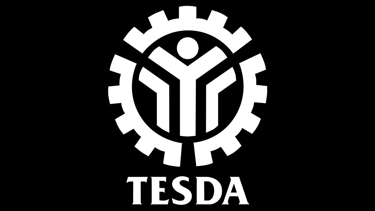
Symbol overview
Before we start “deciphering” the meaning of the logo, it’s reasonable to take into consideration the aim and mission of the agency. To begin with, it was created as a way to manage and supervise technical education and skill development, while the official explanation of the mission states that the agency shows the direction and promotes actual standards and programs of modern technical education and certification. With these points in mind, it’s easier to understand the meaning of the TESDA logo.
Technically speaking, the logo can be broken into two parts: the emblem and the lettering. The emblem, in its turn, consists of three parts, each with a meaning of its own.
Three parts of the emblem
Let’s start the explanation from what appears to be the central elements – the triangular lines. This group includes the “Y”-shaped design and two symmetrical angular details from both sides. According to the official explanation, this combination symbolizes the three most important pillars of the technical-vocational education – government, industry, and private training institutions.
Right above the “Y”-shape, a solid blue circle can be seen. While a ring generally can mean almost anything, here, it’s a symbol of the skilled manpower of the Philippines. As the official website states it, this is the main reason why TESDA was founded and the main aim it serves.
And now, let’s take a look the three identical elements forming the outline of the design. It’s a classic rotary wheel. As part of the TESDA logo, it’s a symbol of a rather complex concept – industrial progress powered by successful and carefully planned manpower development (which is represented by the elements inside the wheel).
So, the logo says the same as the agency’s official mission, just uses the language of pictures instead of the words.
Font
![]()
The typography is pretty legible without sacrificing a distinctive and unique style. The lettering is based on the font called Fremont Bold, which was published by FontSite Inc. While serif fonts are typically used in governmental bodies’ logos, they have a tendency to look somewhat old-fashioned. That’s not the case here, though. In Fremont, the serifs look memorable and recognizable because of their unconventional shape.
On the downside, we can’t say that this type goes well with the pictorial part of the logo – the two parts of the design don’t seem to have “rhyming” elements, which could have helped to merge them visually.
Colors
![]()
The saturated, deep, and very impressive shade of blue is the only color used on the logo, apart from the white background. The coordinates of the blue within the hex system are #052569 or somewhere around.


