The history of TAP Air Portugal began in 1945. Today, it is the country’s flag carrier airline. The headquarters are located at Lisbon Airport.
Meaning and history
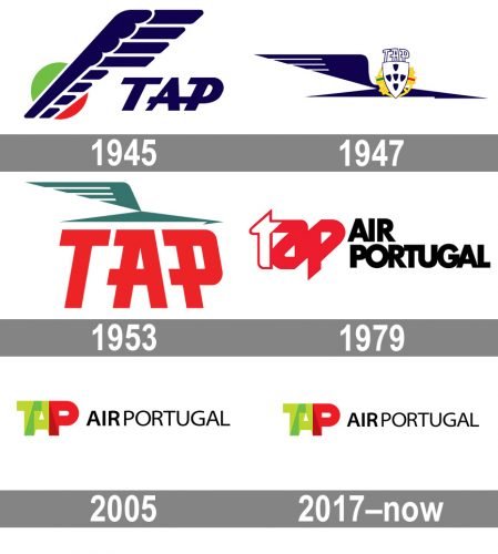
TAP Portugal Airlines, a Portuguese airline based in Lisbon, has been operating since 1945. It is one of the main European operators for flights to Africa, North and South America. TAP Airlines serves a total of 75 destinations in 34 countries. In addition, TAP is considered the largest carrier with flights to Brazil.
In 2005 TAP Portugal has joined the world’s largest and most reputable aviation alliance, Star Alliance. TAP Portugal Airlines won the World Travel Awards for “Best Airline to South America” for four consecutive years in 2009, 2010, 2011 and 2012.
What is TAP Portugal?
TAP Portugal is the name of the Portugal’s main airline, with up to 2,500 flights per day and a route network spanning four continents and including 89 destinations in 34 countries. Its headquarters and main hub are at Portela Airport (Lisbon). TAP began operations in 1945 as the national carrier of Portugal.
1945
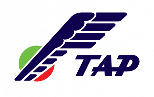
The initial TAP Portugal airlines logo was created in 1945 and featured a bright and intense combination of an emblem and a bold logotype. The emblem depicted a vertically stretched stylized wing in navy-blue, with the green and red (colors of the national flag of Portugal) circle placed behind it at its bottom part. The blue wing and its details were outlined in white. As for the lettering, the “TAP” in all capitals was executed in a modern and sharp sans-serif typeface with the letters slightly italicized and the bars of “A” and “P” elongated.
1947
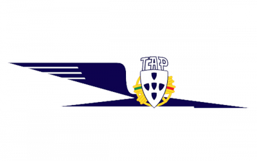
The redesign of 1947 made the TAP badge sharper and more elegant, turning the bold smooth wing into a sophisticated bird drawn in pointed lines. The lettering, which now was set in white capitals, outlined in blue, and executed in a straight geometric sans-serif, was set above the white and blue crest, placed over a circular golden medallion with green and red lines. It was a light and memorable badge, which perfectly represented the essence of the company, its purpose, and its main values.
1953
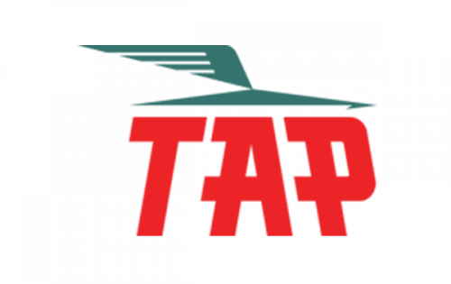
The badge, used by the Portuguese air carrier from 1953 to 1979 was executed in a red a muted turquoise color palette, with the turquoise bird, repeating the one from the previous badge, but redrawn in a smaller size, placed above a bold red logotype in the corporate sans-serif typeface, with the capital letters having their horizontal bars elongated and stretched to the left. The “T” and “P” were slightly slanted to the middle “A”, making the simple composition look more interesting and playful.
1979

Red color remained the main in the TAP color palette, but turquoise was replaced by black in 1979, along with the overall composition of the badge, which got a completely new style and character. It was a stylized lowercase “TAP” emblem with the letters connected to each other, the first one in white, outlined in red, and two following solid red. The emblem was set on the left from the black two-leveled wordmark in a bold and stable sans-serif typeface, with all letters placed close to each other, and come off the bars glued.
2005
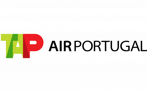
The green and red color palette was brought back to the logo in 2005, with the new emblem, composed of three overlapping capital letters, set in the left from the “Air Portugal” wordmark in the uppercase of an elegant sans-serif typeface, with two parts placed close to each other, but the “Air” in bolder lines. It was a simple yet memorable and eye-catching logo that stayed with the air carrier for a decade and got only slightly modified in 2012.
2017 – Today
The TAP Portugal logo is bright and uplifting. The letters in the word “TAP” overlap, which makes the design memorable and distinctive. On the downside, this approach also makes it more difficult to read. The lettering “Air Portugal” is perfectly legible, though.
The TAP Air Portugal logo features an unpretentious sans. The two words are separated not only by the white space (which is rather small) but also by using two different type weights (bolder for “Air” and lighter for “Portugal”).
Font and Color
The modest uppercase lettering from the primary logo of TAP Portugal airlines is set in two styles of a traditional sans-serif typeface, with the “Air” executed in thicker lines, and the “Portugal” — in thinner ones. The closest fonts to the one, used in this insignia, are, probably, Myriad SemiExtended, or Aleante Sans Regular.
As for the color palette of the TAP Portugal visual identity, it is based on the combination of green and red, the colors of the official flag of Portugal, and black for the lettering. Green also stands for progress and growth, while red is the commonly known symbol of power and determination, and black here emphasizes the professional qualities of the company.


