The 20 varsity teams comprising the athletic program of Syracuse University in Syracuse, New York, belong to NCAA Division I and the Atlantic Coast Conference.
Meaning and history
Syracuse Orange is a collegiate athletic program from Syracuse University, a private educational institution in New York, the United States. The university was established in 1870 and during the first years of its history was closely connected to the Methodist Episcopal Church.
As for the athletic program of ‘Cuse, the Syracuse Orange, it is composed of twenty men’s and women’s teams, which compete in the first division of the National Collegiate Athletic Association, in various sports disciplines, including Basketball, Football, Soccer, Track and Field, and many others.
1967 – 1988

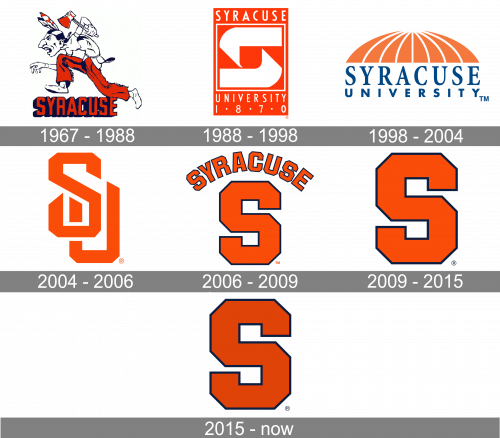
The Syracuse Orange logo designed in 1972 was the most ornate and funny of all the versions ever created for the athletic program from Syracuse. It was a cool Native American man caricature in white and its black contouring. The man was wearing orange pants, which were balanced by white and orange feathers coming out of his hair and a small orange tomahawk in one of his hands. The man was drawn in profile facing to the left and the image was placed above the bright geometric “Syracuse” logotype in the uppercase. The orange letters were outlined in dark blue and had the shadow of the same color.
1988 – 1998

The redesign of 1988 simplified and modernized the visual identity of the club. Now it was a vertically oriented rectangular banner in solid orange with a square white framing in its muddle. Inside the white square, there was a stylized futuristic letter “S” composed of two thick white fragments, which were forming a small orange square in the negative space. As for the lettering, it was all white and placed on an orange background above and under the square part of the logo. The “Syracuse” in a narrowed sans-serif was set on top of the badge, while the “University 1870” — on the bottom.
1998 – 2004
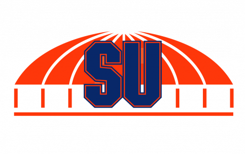
In 2001 the Syracuse Orange logo was redrawn again. This time it was a new composition, formed by a stylized image of an arched stadium roof in orange and white, with the emboldened “SU” abbreviation in dark blue placed over it, in the middle. The lettering was executed in extra thick lines of a geometric sans-serif typeface with straight lines and numerous distinct angles. The massiveness of the letters was balanced by a thin orange outline drawn from the inner side of the contour.
2004 – 2006

The redesign of 2004 introduced a new logo for the program. It was a simple yet sleek and modern “SU” monogram in orange, placed on a white background. Two intertwined letters were written in smooth lines with softened angles yet sharp diagonally cut ends of the lines, which represented the determination and power of the teams and their strong character.
2006 – 2009
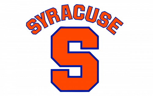
The large block “S” has been the primary athletic Syracuse Orange logo since 2006. The letter itself is orange and has a blue outline.
2009 – 2015
That’s the same letter ‘S’, but without the additional words around and with black edges instead of blue ones.
2015 – Today
The shade of the orange used for the body of the “S” was darkened in 2015, and this made the laconic logo of the athletic program look a bit more serious and mature.
What is Syracuse Orange?
Syracuse Orange is the name of the college athletic program from the Syracuse University in New York. Today it is a very successful program, which consists of twenty various men’s and women’s teams that compete in different sports disciplines. The teams play in NCAA Division I.
Syracuse Orange Helmets
Throughout the history of the Syracuse Orange athletic program, the helmets of the players changed their design several times, but the only thing has stayed untouched — on each of the versions you could see the bright shade of orange — whether as the main color of the helmet or as an accent, used for the logo of the program.
2005 – 2006
The helmets used by the Syracuse Orange players in 2005 were colored bright orange and had a solid blue stripe coming through the middle. The same shade of blue was used for the numbers of the players, written in large square digits on the sides of the helms. The bars were silver-gray.
2007
In 2007 the players’ numbers on the helmets were replaced by the logo of the athletic program, a geometric capital “S”, drawn in solid blue on a bright orange background. The stripe in the middle and the gray bars remained untouched.
2009 – 2015
The design of the Syracuse Orange helmets was changed in 2009, with a brighter shade of orange and a thin white stripe diluting the wide blue one. The emblem on the side of an orange helmet was also redrawn — in a darker shade of blue and with a delicate white outline, which added distinction.
2015 – 2019
In 2015 the main color of the Syracuse Orange helmets turned dark blue, and the emblem was set in orange. The stripe was removed from the concept, as well as the white outline for the massive orange “S”. The grille was colored blue too.
2015 – 2019
Another helmet design, adopted in 2015, featured a solid orange background, with the blue “S” without any outline, and the blue grille. The thin light gray belts complemented the style.
2015 – 2019
The teams of the Syracuse Orange athletic program had one more option for helmets in 2015: it was a total white helmet with a white grille, and just one bright detail — a geometric capital “S” on the side. The light gray belts, coming from the grille, were slightly diluting the snow-white style.
2019 – Today
In 2019 the Syracuse Orange teams adopted two new helmet designs. The main one is based on an intense shade of orange for the background, a deep blue for the “S” and the wide stripe, which was brought back. As for the grille? Now it is set in black; making up a more brutal and aggressive look.
2019 – Today
The second option for the Syracuse Orange helmets, introduced in 2019, is set in white, with a blue and orange stripe in the middle, and the massive orange “S” on the side, with a thin blue outline for a stronger contrast. Just like on the primary version, the grille here is also set in black.
Syracuse Orange Stadiums
There are several stadiums, where the teams of the Syracuse Orange athletic program compete and get prepared for competitions and championships. Different disciplines of the program have different needs, and all of them are provided by the university on their official sports grounds.
John A. Lally Athletics Complex
Built in 1962, the John A. Lally Athletics Complex, formerly known as Manley, replaced the old Archbold Gymnasium, which served as the university’s main sports arena from 1908. In 2023 the current name was given to the gymnasium, after its complete renovation. Today the complex is used by all twenty teams of the Syracuse Orange program.
JMA Wireless Dome
The main arena of the Syracuse Orange athletic program is the JMA Wireless Dome, which is the largest domed stadium among the universities of the United States, and the only domed stadium in the north-east of the country. It was built in 1980 as the Carrier Dome and was renamed in 2022.
Tennity Ice Skating Pavilion
Another sports facility, used by the teams of the Syracuse Orange program is the Tennity Ice Skating Pavillion. It has everything needed for training in such sports disciplines as ice hockey, curling, and sled hockey. The pavilion opened its doors in 2000.
Syracuse Orange Uniforms
All twenty teams of the Syracuse Orange athletic program have their recognizable uniforms, designed in the orange blue, and white color palette, which is full of energy and makes the players of the teams visible on any field.
Football Uniform
The uniform of the Syracuse Orange football team is composed of orange pants with blue and white stripes on the sides, supported by the blue and white stripes on the orange helmets. As for the jerseys — they can we whether white, with blue and orange details, or dark blue, with white player’s numbers on the chest, and orange lettering.
Soccer Uniform
The soccer team’s uniform of the Syracuse Orange program is a bit more simple than the football one. The home uniform is composed of jerseys with blue and orange wide horizontal stripes and dark blue shorts. The soccer gaiters are solid orange. When the team plays not in their home arena, the uniform is very modest and light—gray jerseys with vertical white stripes, white shorts, and gaiters.
Basketball Uniform
For the Syracuse Orange basketball team, the home uniform is set in white, with the top and the shorts featuring wide orange stripes on the sides. When the team competes on other grounds, the reverse uniform is used — with the solid orange t-shirt and shorts having wide white stripes on the sides.
Syracuse Orange Mascot Logo
The mascot of the Syracuse Orange athletic program, Otto the Orange, was adopted by the teams at the beginning of the 1980s, and since then has never left the athletes, encouraging them and sharing their energy. Throughout the years, the design of the mascot has changed several times, but there has always been a bright striped cap and a smile on the face.
1980 – 2004
The original Otto the Orange image was introduced in 1980 and stayed untouched till the beginning of the 2000th. It was a cute fluffy orange in a cap with blue and orange vertical stripes, and solid blue gloves on the widespread hands. The creature looks very sweet with its huge kind eyes and a tender timid smile.
2001 – 2004
In 2001 a new design for Otto was created — the same color palette and main shapes, but now the mascot was smiling wide, showing its teeth, and this smile was less friendly, on the contrary, it was somewhat sarcastic and even mean. Another difference from the original design was in the clean and even contours of the creature.
2004 – 2006
In 2004 the image of Otto the Orange was refined and strengthened. The color palette was intensified with both orange and blue shades deepened. With the new color scheme, the white “SU” monogram on the cap became more visible, and the smile of the mascot — was even more sarcastic.
2004 – 2006
The cute Otto was redrawn in 2004 too. With the colors darkened up, and the pupils in the mascot’s eyes changed from white to orange. Another new thing on the image was in the design of the cap, the SU monogram, which was rewritten, and now the characters did not overlap each other.
2006 – 2009
The redesign of 2006 only touched the cap of the mascot, namely, the monogram on it. Now it was not already a monogram; but a bold angular letter “S”, like the one on the official logo of the Syracuse Orange program. The letter was drawn in white with no outline.
2006 – Today
The orange pupils turned back to white in 2006. And the cap was redrawn again. The thin blue “SU” lettering was replaced by a bold blue “S” in a geometric sans-serif, representing the new official logo of the teams.
2009 – 2019
The last version of the widely smiling mascot was introduced in 2009. It was still the same orange and blue design, the same shapes, same elements, but the letter on the cap turned orange now.
Font and Color
The Syracuse Orange logo is based on just one symbol — a stylized heavy geometric letter “S”, which is definitely hand drawn, yet based on a modern sans-serif typeface with straight lines and angles.
As for the color palette of the Syracuse Orange visual identity, as is expected from the name, the scheme is based on an intense shade of orange, with an addition of black for the contouring. Orange is a color of motion and energy, and black adds a touch of professionalism and responsibility.
Syracuse Orange Colors
SYRACUSE ORANGE
HEX COLOR: #F76900;
RGB: (247, 105, 0)
CMYK: (0, 62, 95, 0)
PANTONE: PMS 158 C
WHITE
HEX COLOR: #FFFFFF;
RGB: (255, 255, 255)
CMYK: (0, 0, 0, 0)
PRIMARY BLUE
HEX COLOR: #000E54;
RGB: (0, 14, 84)
CMYK: (100, 85, 5, 36)
PANTONE: PMS 281 C


