Sydney Swans is a professional Australian football team from Sydney. It’s one of the older such teams in existence – their first matches were played back in the 1870s. Until fairly recently, the club was based in Melbourne. The current Sydney iteration of the Swans came to be in the 80s.
Meaning and History
The team was established in 1874 in Melbourne, another Australian city. They continued to use their colors, nickname and traditions into the 1980s, although by that point the team was moved to Sydney. The team mainly used red and white colors for identification and branding throughout their history.
What is Sydney Swans?
Sydney Swans is an old professional team that plays Australian football. It was originally founded in the late 19th century. The current form (as ‘Sydney Swans’) was assumed in the 1980s.
1960s
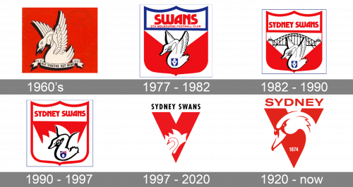
Their first ever proper emblem was a red square with a white image of a swan placed in the middle. They gave it an aggressive look, what with the lifted wings, open beak and malicious features. The bird was sitting right on the white ribbon that said the team’s motto of ‘you either win or die’ in Latin.
1977 – 1982
Next, they adopted a shield shape, divided in two sections. The uppermost part of the shield was outlined in blue. Inside, the words ‘Swans’ and ‘Sth Melbourne Football Club’ were written in red letters against the white background. Below these much of the shield was red with a single white triangle cropping up from above. In the middle, there was another mean-looking swan.
1982 – 1990
By 1982, the team moved to Sydney. As such, the name in the upper part of the shield changed to ‘Sydney Swans’ (in one line this time), the outline around this area turned to red. As for the main section, the white triangle was extended, and inside of it they put a black silhouette of the famous Harbor Bridge from Sydney.
1990 – 1997
In the 1990 shield design, they swapped the colors in the main section, which meant there was now a smaller red bit on top of an otherwise fully white background. They shaped the latter into the general shape of a Sydney Opera. And it was helped by the swan’s two wings, which were reshaped to fit the silhouette.
1997 – 2020
The 1997 design used a much simpler basis – a big red ‘V’ (presumably, for ‘Victory’). Right above it, the words ‘Sydney Swans’ were written in black sans-serif letters. Near the center of the ‘V’ part, however, they still placed the white semblance of the Opera with a red outline of a swan inside it. They decided to not give make it aggressive this time.
2020 – today
In 2020, the wordmark above became just one word ‘Sydney’, colored red. The swan’s head now occupied much of the space in front of the letter ‘V’, and they actually gave the bird a lot of nuance. The year ‘1874’ was written near the bottom.


