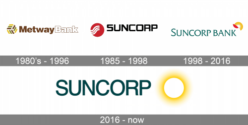
Since the 1980s, the Suncorp Bank logo has gone through at least three updates. In most cases, the modifications have been quite profound – in fact, we can talk about completely new logos, although all of them have preserved the two core elements: the stylized sun and the name of the bank.
Meaning and history
Since its founding in 1902 as the Agricultural Bank of Queensland, by today Suncorp Bank has grown to the fifth largest bank in Australia. Headquartered in Brisbane, the bank has branches all over the country, serving millions of Australian clients, and providing a full range of banking services to the population.
Today’s Suncorp is a result of a merger of three companies, which happened in 1999. Those were the Suncorp Bank, established in 1916 as the governmental insurance company, the Queensland Agricultural Bank, and Metway Bank, the public Australian company.
What is Suncorp Bank?
Suncorp Bank is the name of an Australian bank, which was established in Brisbane in 1902. Today Suncorp is one of the six largest banks in its country, which provides its customers with such services as consumer banking, credit cards, mortgages, business loans, and others.
1980
To better understand the evolution of the brand’s visual identity, it would be interesting to take a look at the emblem of Metway Bank. If you compare it to the following logo, you will notice the ray motif and the circle theme present in both of them.
The old Metway Bank logo used before the merger featured a hexagon formed by brown, yellow, and green bars. Next to it, there was the lettering “MetwayBank.” The first part of the word (“Metway”) was brown, while the word “Bank” was white with brown trim. The structure of this logo looked very much like that of the following Suncorp logo, although all the details were different.
1996
In late 1996, Suncorp and Queensland Industry Development Corporation, which belonged to the Queensland Government, were merged into Metway Bank. As a result, the Suncorp Metway group was formed.
In the spring of 1999, the brand Suncorp Metway was officially introduced.
The logo featured a red circle, which was apparently the stylized sun. There were three waves in the circle, which had been borrowed from the Metway logo. The word “Suncorp” featured a minimalistic sans. The letters were capitalized and were based on a rectangular shape. They were solid black.

1998
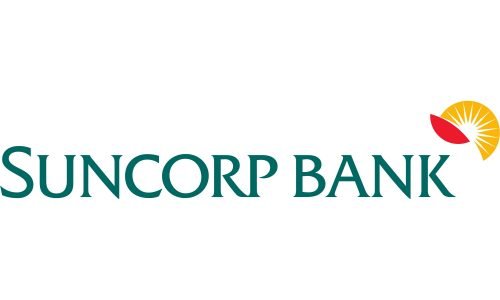
The sun grew white and yellow. It was rising from behind a red abstract shape reminding a leaf. At the forefront, there was the teal lettering “Suncorp Bank.” The logo also existed in other color variations.
2016
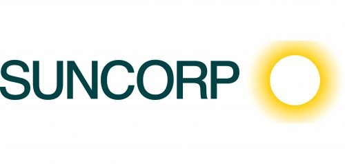
The teal on the Suncorp Bank logo grew darker. The lettering was reduced to “Suncorp,” which made the design cleaner and easier to grasp. Now, it featured a simpler sans serif type (Helvetica), all the letters were capitalized. Instead of the part of the sun, you could now see the full circle, while the red shape disappeared.
Font and Color
The modest uppercase lettering from the primary Suncorp logo is set in a clean traditional sans-serif typeface with medium-thick lines and simple contours of the letters. The closest fonts to the one, used in this insignia, are, probably, Nimbus Sans Novus D Semi Bold, or Helvetica Now Display Medium.
As for the color palette of Suncorp’s visual identity, it is based on a combination of dark green and yellow, which creates a bright image and shows the company as a progressive and dynamic one. Yellow is a color of energy and joy, while green adds stability and a sense of development.


