Although the logotype of the insurance company State Farm bears a somewhat awkward resemblance to an egg farm logo, it’s very recognizable and has preserved its overall look for more than 60 years.
Meaning and history
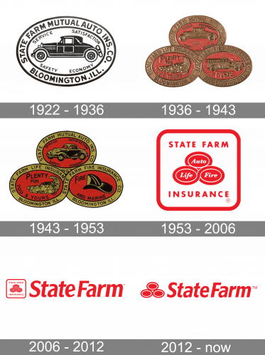 The State Farm Insurance Company’s visual identity was lucky to find its iconic brand signifier at the very beginning of its history. The logo, created in 1922 became a basis for the iconic emblem, which was introduced in 1936, and this emblem went all the long path with the company, turning into a modern and recognizable symbol we all know today.
1922 – 1936
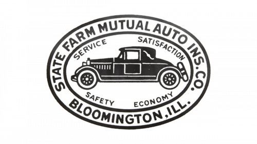
The original State Farm logo was composed of a horizontal oval badge in a double outline, where the wordmark in a bold sans-serif was located. In the middle of the badge, there was an image of a car in monochrome, with an additional inscription around it. The text included “Service. Satisfaction. Service. Economy” the four main principles of the insurer.
1936 – 1943
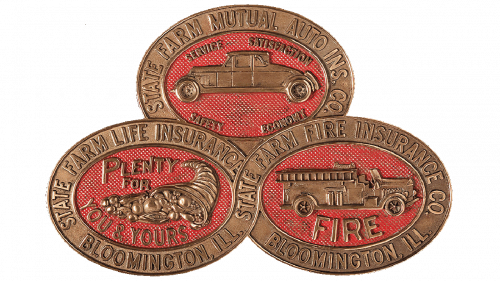
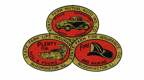
In 1936 the oval badge became one of three of a similar style, flyer to each other and forming a triangle. The color palette was switched to red and gold, and the whole emblem became bright and memorable.
1943 – 1953
The three coins got smaller and returned to monochrome in 1943z the emblem was placed under the bold and narrowed sans-serif inscription, located inside a white horizontal rectangular with the company’s office building image on the left. There was also additional lettering on the logo, executed in small cursive.
1953 – 2006
In 1953 the logo gets redesigned again, placing three red coins in the middle of the square badge with rounded angles. The “State Farm” in all capitals was placed above the emblem, and the “Insurance” — under it. The body of each coin featured solid red, while the double white outline was balanced by white cursive lettering, which included “Life”, “Auto” and “Fire”, the main types of insurance the company worked with.
2006 – 2012
In 2006 the square with rounded angles is being placed on the left from the enlarged italicized wordmark, which is executed in the same shade of red and uses an elegant sans-serif typeface with smooth lines and distinct cuts of the letter-ends. The wordmark could also be seen on its own, without an iconic emblem.
2012 – Today
The redesign of 2012 simplified the previous version of the State Farm’s visual identity by removing framing and lettering from the emblem, making it just a triangle composed of three red and white coins. As for the wordmark, it remained almost untouched after the redesign of the logo by Chermayeff & Geismar.
There is also an icon, which the company uses for its website and mobile apps — the whole three-coins emblem is placed on a gradient red background, looking modern and sleek.
Font
The custom typeface features quite an appealing combination of the kerning and the letterforms. It seems to go well with the logo without stealing the limelight. In comparison with the previous version, the top ends of the “a’s” have been slightly moved down, which eliminated the awkward white space between the “t” and the “a,” as well as between the “f” and the “a.”
What are the 3 circles in the State Farm logo?
The three circular elements on the logo of the Astarte Farm insurance company stand for the three types of insurance the company provides its customers with vehicles, life, and fire. In the earliest versions of the logo, all three circles comprised the lettering, which explained their meanings, but with the latest redesign, the badge got minimized.
What is the symbol for State Farm?
The symbol of State Farm is a pyramid, composed of three horizontally-oriented ovals in red and white, with each of the ovals standing for one of the company’s directions. As an insurance provider, State Farm has the vehicle, life, and fire insurance as its main specializations.
What is State Farm’s catchphrase?
The famous catchphrase of the State Farm insurance company, “Like a good neighbor, State Farm is there”, was introduced at the beginning of the 1970s, and by today has become an essential part of the company’s identity. However, today one more slogan version can be seen on the State Farm’s badges, and it is “Here to Help Life Go Right”.
What is the State Farm font?
The simple italicized inscription from the primary State Farm logo is set in the title case of a traditional sans-serif font; which is pretty close to such types as Frutiger Std 78 Black Condensed Italic, and Bernini Sans Bold Italic. The name of the font, used in this insignia is State Farm News Gothic.


