Masterpass is an electronic wallet by MasterCard. The product was released in 2012 and today is one of the most popular digital wallets for online shopping.
Meaning and history
Being a MasterCard brand, Masterpass’s visual identity is fully based on its mother-brand logo design concept.
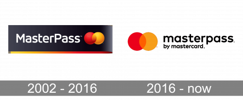
2002 – 2016

In the original logo, the two circles were placed to the right of the wordmark. The name of the brand was given in a sans serif type. While its overall style resembles the current one, it is in fact slightly different. Also, the letters “M” and “P” are capitalized.
2016 – Today
The 2016 logo is composed of a wordmark and the iconic emblem, which can be placed on the left or above the lettering.
The Masterpass wordmark in lowercase letters is executed in a sleek and modern sans-serif typeface with straight clear lines and rounded shapes. It looks solid and stylish, especially in black.
Unlike other MasterCard products, which visual identity varies in color schemes, Masterpass uses exactly the same color palette. Two bright overlapping circles, red on the left, and orange on the right, symbolize energy and passion, showing one of the most progressive and influential companies in the world.

It is a remarkable and instantly recognizable visual identity, which evokes a sense of professionalism and authority, as well as expertise in everything, starting the financial segment and finishing with the design.


