Standard Chartered is an English Bank, which was founded in 1853 and integrated in 1969. The bank has more than a thousand offices in 70 countries across the globe and is one of the most reputable British financial companies.
Meaning and history
1969 – 1975
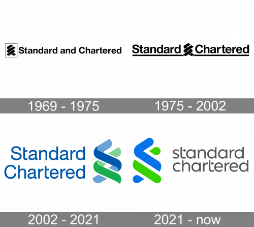
The spiral emblem was already present on the 1969 logo. Here, the spirals were black and were placed inside a white box with a thin black border. The lettering next to it looked very much like the typography in the current logo, although it wasn’t exactly the same.
1975 – 2002

The box was gone, while the spirals were now placed between the two words. The type grew slightly bolder, and a horizontal line appeared below the wordmark.
2002 – 2021
The Standard Chartered logo is composed of a wordmark and an emblem on its right. The wordmark is executed in a thin yet confident sans-serif typeface with rounded letters. The “Standard” part is placed above the “Chartered” one.
The famous Standard Chartered emblem comprises two vertical spirals, one green, and another one blue. Intertwined with a three-dimensional effect, the spirals symbolize a solid and reliable partnership between the bank and its clientele.
The spirals are also a graphical representation of the first letters of the company’s name. The blue spiral forms “S”, and the free one — “C”.
The Standard Chartered color palette is based on calm shades of green and blue, which are colors of life and energy. The blue symbolizes the responsibility and professionalism of the company, while green shows the bank as loyal and energetic.
It is a modest yet strong logo, which reflects the bank’s policies and trustworthy. The spiral Standard Chartered symbol is instantly recognizable and makes the bank stand out.
2021 – Today
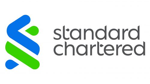
During the 2021 redesign, they switched positions for both parts of the logo and remodeled them. The emblem became a much simpler design with round shapes this time, as well as just one color shade both for a green and blue figures – namely, lime and light blue.
The wordmark mostly used the same letters, except they all became lowercase, grey and were reshaped in some places. The bars in ‘T’s became drop-like figures with just one per letter, although there were also some differences.


