

![]() MUFG Union Bank Logo PNG
MUFG Union Bank Logo PNG
MUFG Union Bank is a full-service bank with its headquarters in New York City. The number of branches is around 400. It is a subsidiary of holding company MUFG Americas Holdings Corporation.
Meaning and history
![]()
MUFG Union Bank is an American bank with a long history and a strong reputation. The company was established in the middle of the 19th century in California, as the Bank of California. The name stayed unchanged for more than a century, until 1996 when the bank got rebranded as the Union Bank of California. As for the current name of the company, it appeared in 2008.
Founded by Kaspare Cohn, today MUFG Union Bank, headquartered in New York, is owned by the Mitsubishi UFJ Financial Group, a Japanese financial holding, established in 2005, and operating globally.
What is MUFG Union Bank?
MUFG Union Bank is the name of an American financial organization, which was established in 1864 under the name Bank of California. Today the company is based in New York and has almost 400 branches across three states: California, Oregon, and Washington.
1864 – 1914
![]()
The founding date of the oldest of the acquisitions, The Bank of California, is 1864.
1914 – 1996
![]()
The history of the MUFG Union Bank logo is closely interconnected with the history of the bank itself, with the mergers and acquisitions that have formed the bank. The roots of MUFG Bank, Ltd, can be traced to Kaspare Cohn Commercial & Savings Bank founded in Los Angeles in 1914.
1996 – 2008
![]()
In 1996, the bank became known as Union Bank of California. It adopted a logo that was bright and eye-catching, although not perfectly legible. It featured a red box housing the words “Union Bank of California” in white.
The type itself was a pretty legible sans, and the contrast between the lettering and the background did not spoil the legibility. And yet, the proportions of the box made the designers reduce the size of the letters. Due to this, when the MUFG Union Bank logo was not large enough, it was more difficult to figure out what the name of the bank was than in the case of an average bank logo.
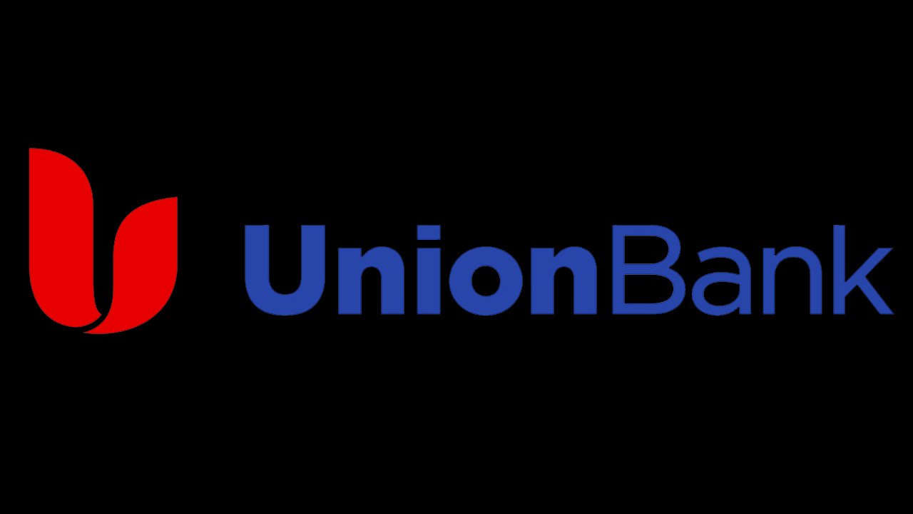
2008 – Today
![]()
The redesign solved the legibility problem. It reflected the new name of the financial institution, MUFG Union Bank (stylized as UnionBank). There were no more red boxes. Instead, you could see the name of the bank in blue over the white background. While there was no blank space between the two words comprising the company’s name, they were separated from each other with the help of the typeface. The word “Union” was given in bold, while the word “Bank” featured a lighter type.
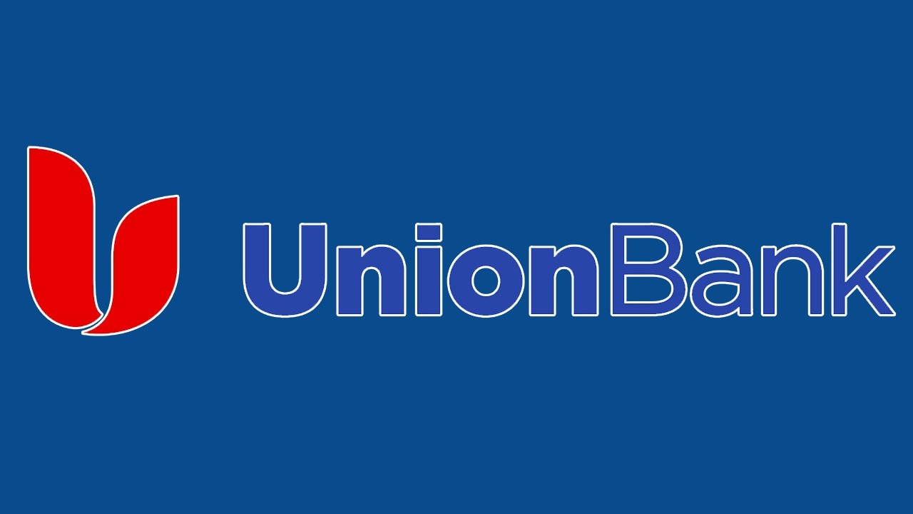
To the left, there was a stylized “U” in red. The letter was comprised of two asymmetrical parts. While the shapes are pretty abstract, they bear a vague resemblance with the fire or birds with their beaks directed upwards.
Font and color
The title case lettering from the primary badge of the MUFG Union Bank logo is set in two styles of one traditional sans-serif typeface, with clean lines and distinctive contours. The first part is written in bold font, while the “Bank” is set in the medium-weight one. The closest fonts to the one, used in this insignia, are, probably, Kaleko 205, Eastman Roman, or Modica.
As for the color palette of the MUFG Union Bank visual identity, it is based on the combination of smooth yet bright shades of blue and red, with the background usually executed in plain white. This is a very popular tricolor for logos of various large companies, as it reflects all the necessary qualities, such as power, professionalism, and excellence.


