Spanair is an airline company that specializes in providing domestic and international flights. It was founded in 1986 and is currently owned by a consortium led by Scandinavian Airlines System (SAS). Spanair operates from its main hub at Barcelona El Prat Airport and serves various destinations across Europe, North Africa, and the Middle East. With its fleet of modern aircraft, the company ensures comfortable and reliable air travel for passengers.
Meaning and history
Spanair is an airline founded by SAS Group and Teinver in 1986. Over the years, it has achieved several significant milestones. In 2003, Spanair became a member of the Star Alliance, a prestigious global airline network. The airline expanded its routes, connecting passengers to various destinations in Europe, North Africa, and the Middle East. Spanair also focused on maintaining a high level of safety and received the IATA Operational Safety Audit certification. However, the company faced financial challenges, and in 2012, it filed for bankruptcy, leading to the suspension of its operations. Currently, Spanair is no longer operational, and its assets have been liquidated.
What is Spanair?
Spanair was a Spanish airline that operated from 1986 to 2012. It was based in Barcelona and served as a major carrier for domestic and international flights. However, the airline ceased operations in 2012 due to financial difficulties.
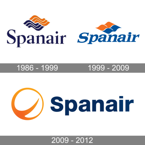
1986 – 1999
The first Spanair logo, created in the middle of the 1980s, featured a simple yet elegant composition of a title case lettering in a serif typeface, set in a dark shade of blue under a stylized orange and blue emblem, formed by two parts with delicate waves on each. The emblem evokes a sense of motion and looked very friendly and delicate.
1999 – 2009
The redesign of 1999 has refined the contours of all elements on the Spanair logo and switched the color palette to a lighter one. The wavy pattern on the emblem was replaced by a solid one, while the two elements were changed to four, forming a rhomboid figure. As for the lettering, it got emboldened and slanted, adding more vitality to the composition.
2009 – 2012
In 2009 the Spanair badge has undergone another redesign, with both the blue and orange shades getting darker and more intense. The new concept depicts a stylized geometric emblem, looking like a ring with a playful stroke in the middle. The orange of the emblem has smooth gradient shades. The wordmark was also fully rewritten, and now it is set on the right from the emblem in the title case of a stable geometric sans-serif typeface.


