Southland Conference is the name of the athletic program’s conference, which has 13 members among the universities of the South Central US region. The conference consists of men’s and women’s teams which compete in 18 different sports disciplines.
Meaning and history
Initiated in 1963, the Southland Conference stands as a testament to the evolution of collegiate sports in the United States, particularly within the Southern regions. Its inception was a strategic move to bolster college-level athletics, fostering a competitive yet collaborative spirit among its member institutions. Throughout its history, the Southland Conference has achieved significant milestones, particularly shining in sports like basketball, football, and track and field. This conference has served as a launchpad for numerous athletes, catapulting them into prominent careers in professional sports and international arenas.
A distinctive aspect of the Southland Conference is its commitment to balancing athletic prowess with academic excellence. This holistic approach has sculpted its identity, earning it acclaim as a conference that nurtures well-rounded student-athletes. In recent times, the Southland Conference continues to be a prominent player in NCAA Division I sports. It upholds its legacy by driving competitive spirit among its teams while steadfastly adhering to its core values of academic integrity and athletic excellence.
What is Southland Conference?
Southland Conference is the name of the conference, where 13 university athletic programs compete in Basketball, Baseball, Tennis, and fifteen more sport disciplines. The members of the conference are universities from the South Central United States.
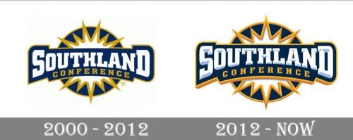
2000 – 2012

The badge of the Southland Conference, designed in 2000, stayed with it for a decade. It was a solid blue circle in a thin yellow gold outline, with a white and gold stylized sun on it. Over the circle, there was a smooth and wide blue banner with bold white lettering in a geometric serif typeface on it. The “Southland” was underlined by an arched delicate “Conference” in yellow capitals.
2012 – Today
On the older logo, the letters in the word “Southland” look flat, while the newer emblem features bluish and grayish highlights adding some depth. Behind the lettering and the stylized sun, there is a dark blue circle with orange trim.


