Snickers is an iconic label of chocolate bars, produced by Mars, which was founded in 1932. The brand is extremely popular across the globe and is known for its funny and strong advertising campaigns.
Meaning and history
The world’s most famous chocolate bar was named after the horse. It was a favorite horse of the founder’s family and made a great branding for the popular sweet snack.
1930 – 1939
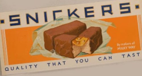
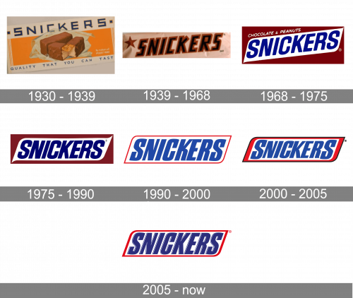
The original logo was a white rectangle with an orange core. On the white space left in the top and bottom, they wrote ‘Snickers’ in linear blue letters and ‘quality that you can taste’ (respectively). The center was occupied by a picture of Snickers candy lying on a wrapper.
1939 – 1968
The first Snickers logo was introduced in 1939 and featured a wordmark and a star symbol on its left. The wordmark was executed in all capital letters, which were sharp and brutal. The black nameplate had a brown outline, which resembles chocolate. The star used the same color palette as the inscription.
1968 – 1975
In 1968 the brand’s logo started gaining the shape we all know today. The lettering now featured a refined and more modern typeface and the color palette switched to blue. The logo is placed on a white background, which makes is bright and strong.
1975 – 1990
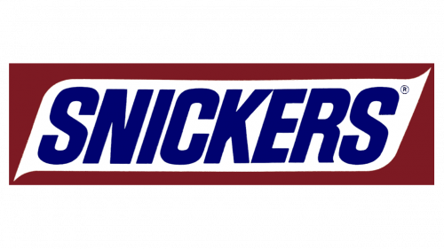
Compared to previous design, this one doesn’t have a ‘chocolate & peanuts’ bit. Plus, the central white figure (and the text in it) are perfectly horizontal, unlike then.
1990 – 2000
In 1990 the wordmark gets a thin rectangular framing with rounded angles and inclined sidebars. The typeface is slightly italicized and boasts stronger thicker lines.
2000 – 2005
The Snickers’ visual identity redesign of 2000 thickens the red frame and enlarged the first and the last letters “S”. All the other letters are equal in size and look compact and bold.
2005 – Today
The redesign of 2005 makes the logo frame thinner and brings back the all-capital letters to one height. The lines of the typeface are refined and modernized and the letters gained a thin white shadowing, which adds volume and dynamics to the logo.
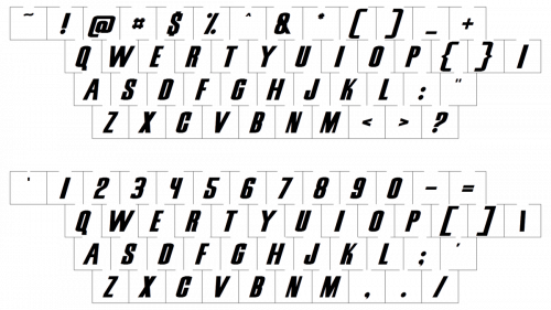
The Snickers typeface is very similar to Lunch Time Normal font, an elegant and strong one.


