Singer is the name of an automaking brand, which was established in the United Kingdom in 1875, and ceased all operations in 1970. During more than a century of its history, the company had designed and released dozens of various car models, which were mainly sedans.
Meaning and history
Though Singer Motor was a company with almost a 100-years history, there has been just one official emblem created for the marque throughout the years. The badge was introduced at the very beginning of the brand’s life, and stayed with it till the end, being accompanied by various nameplates, placed on the bonnets and grills of the Singer vehicles.
Emblem
The official Singer Emblem boasted a monochrome old-style wheel as its main element. The wheel was executed in simple straight lines and featured a medium-thick circular frame. On the Singer wheel, there was a bold sans-serif “S” drawn in black. A very naive yet still strong badge, which has never been redesign, just complemented with various letterings or badges.
Badge
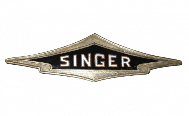
The most commonly used badge for the Singer automobiles was a horizontally stretched banner with the triangular top, pointing up. Inside the silver element there was a black one, repeating its contours, but with a glossy surface and white lettering on it. The “Singer” inscription was set in the uppercase in white color and executed in a square sans-serif typeface with thin yet strong neat lines. The whole letters of the wordmark boasted a thin silver outline, which harmonized the whole look of the badge.
Wordmark
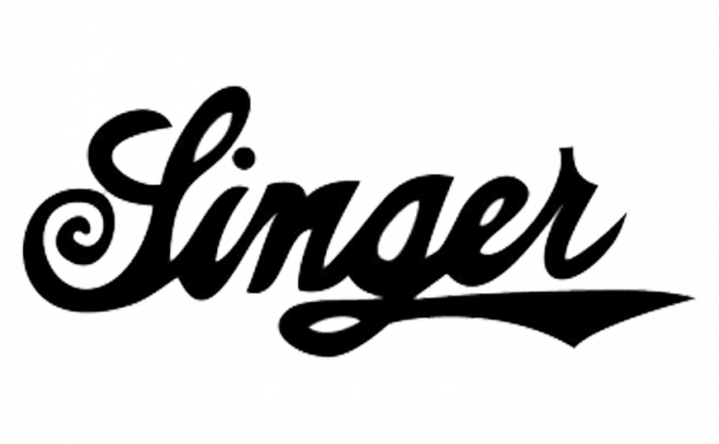
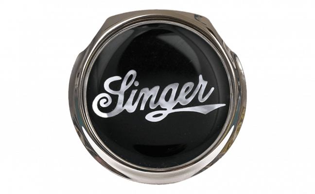
When it comes to Singer text-based logos, there is really a wide range of designs: from fancy cursive in thin silver lines to the bold black script lettering with a leather pattern. The most famous Singer nameplate featured a smooth script typeface with the first “S” capitalized and curved, and the tail of the “G” elongated and sharp, underlining the “E” and “R”. This logotype could be seen in black, used on its own, or as a part of the badge. In the second case, it was written in silver on a black circular medallion with a silver frame.
The second variant of the Singer wordmark was sharper and edgier. A cursive inscription with a “nervous” mood and long strong lines were always written in one shade, no matter what the color of the background was.
Font and color
The custom Singer lettering from its badge with the peak top featured straight lines and shapes, which made the square contours of the sand-serif typeface look serious and confident. That font looks close to British Vehicle JNL Regular and has something in common with Guile Medium.
As for the most famous Singer inscription, the script one, it was also custom and looked similar to UT Marmalade Bold, but with the lines modified and the contours of the letters narrowed.
The color palette of the Singer visual identity was mainly built on the monochrome combination, where white was replaced by silver on the actual badge. Though there were also Singer nameplates on some of the models, which boasted a dark burgundy background, a color, evoking a sense of royalty and nobility.
The black and white and black and silver color schemes of the Singer badges looked strict yet elegant and powerful, showing the marque as the experienced and reputable, and making its badges timeless and actual.


