ShopRite is a supermarket cooperative with a rich history, created by a group of independent grocers to gain purchasing power and compete against larger chains. Born in Newark, New Jersey, it was designed to provide affordable groceries through a collective effort, allowing member-owners to benefit from shared resources while maintaining their independence. ShopRite has grown to become a staple in the northeastern United States, embodying the spirit of collaboration and community service in the retail food market.
Meaning and history
In 1946, Newark, New Jersey, became the birthplace of ShopRite, a visionary supermarket cooperative formed by a group of independent grocers. These pioneers banded together with a common goal: to fend off competition from bigger chains by leveraging collective buying power. This innovative strategy not only allowed them to offer competitive prices but also to maintain individual store autonomy. Over the decades, ShopRite expanded its footprint, becoming a household name in the northeastern U.S., celebrated for its commitment to community, quality, and affordability. The cooperative model empowered local entrepreneurs, contributing significantly to ShopRite’s resilience and adaptability in a fluctuating market.
ShopRite stands as a testament to the power of unity, innovation, and the enduring value of serving and understanding local communities.
What is ShopRite?
ShopRite emerges as a beacon of cooperative enterprise in the grocery realm, founded on the collective ambition of independent grocers in 1946, New Jersey. It exemplifies a unique fusion of community-centric service and economic synergy, offering a diverse array of quality goods while championing the principles of affordability and local empowerment.
1951 – 1975
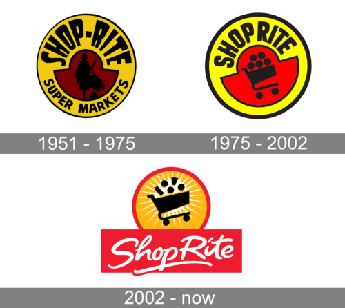
The logo showcases a bold, vintage style with a striking red and yellow color scheme. At the center, a silhouette of a shopper with a cart underscores the focus on consumer needs. Encircling the figure, radiant lines suggest a sunburst, symbolizing vitality and abundance. “SHOP-RITE SUPER MARKETS” arches above in strong, block lettering, anchoring the emblem with a sense of solidity and reliability.
1975 – 2002
This updated logo shifts to a modern, stylized aesthetic with a crisper font and graphic. The central image now features a simplified, iconic shopping cart with five circular items, representing an abundance of goods. The shopper silhouette has been replaced by this cart, focusing squarely on the shopping experience. A bold red half-circle grounds the design, adding a dynamic splash of color that contrasts sharply with the yellow background, encapsulating ShopRite’s energetic approach to retail.
2002 – Today
In this iteration, the logo radiates warmth and movement with sunrays beaming from behind the cart, enhancing a sense of bounty and energy. Below, “ShopRite” is scripted in a flowing, cursive red font that adds a touch of elegance and a friendly, approachable feel. The overall design blends traditional charm with contemporary appeal, indicating a brand that values both heritage and modern shopping experiences.


