Shake Shack Inc is a modern roadside burger stand that is popular because of its use of natural ingredients. Shake Shack is part of Danny Meyer’s Union Square Hospitality Group (USHG). The company’s signature products are all-natural burgers that are free of hormones and antibiotics.
Meaning and history
Shake Shack, a popular American fast-food chain, was founded at the beginning of the 2000s as a small kiosk in Madison Square Park in Manhattan; today it is a growing chain with restaurants in New York, Washington, DC, Connecticut, Pennsylvania, Florida, Massachusetts, as well as in the UK, Turkey, and the Middle East.
The burgers offered by the Company are made from a whole slice of fresh and all-natural Angus beef, free of hormones and antibiotics. Each burger is made to order and served on a GMO-free potato flour bun.
In fact, even though the official foundation of the company is considered to be in 2004, the history of Shake Shack began back in 2001. The brand was born during the reconstruction of one of the most famous public parks in New York – Madison Square. To attract citizens to the renovated park, the authorities organized an exhibition and put a small hot dog cart. However, the regular street food stand was such a success among visitors that it ran for three years instead of one season.
Having assessed the prospects, the authorities arranged a tender to build a permanent establishment, and the winner was Danny Meyer, CEO of Union Square Hospitality Group (USHG), the owner of the hot dog cart. A new building called the Shake Shack soon sprouted up on the familiar site. It was there in 2004 that guests were first allowed to experience the ShakeBurger, which was destined to become legendary.
What is Shake Shack?
Shake Shack is the name of an American operator of a chain of roadside eateries.
The company offers an American menu that includes burgers, hot dogs, crispy chicken, frozen custard desserts, curly fries, cocktails, beer, and wine, among others. Today the company has more than 400 locations, 141 of them — internationally.
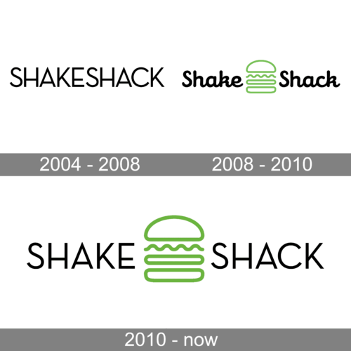
In terms of visual identity, Shake Shack has always been pretty laconic and strict. The graphical part appeared on the logo of the company only in 2008 and hasn’t been changed until today. The color palette of the company’s visual identity also makes it stand out in the list of its competitors.
2004 – 2008
The original Shake Shack logo, created in 2004, was based on just black lettering, set in the uppercase of a medium-weight geometric sans-serif typeface with distinctive contours of the capital letters, straight cuts of the lines, and modern silhouettes. The lettering was placed on a plain white background with no graphical or color additions.
2008 – 2010
The redesign of 2008 has brought a graphical part and extended the color palette of Shake Shack visual identity. The new concept was based on black cursive lettering, with the two parts of the brand’s name separated by a lime-green contoured image of a burger, where two buns had a burger and a wavy leaf of a salad between them.
2010 – Today
With the redesign of 2010, the emblem of the fast-food chain has remained untouched, but the lettering was rewritten. Now the name of the company is set in the uppercase of a sharp and distinctive geometric sans-serif typeface, which resembles the inscription from the original version of the Shake Shack badge. The logo looks very modern and minimalistic, evoking a sense of confidence and excellence.
Font and color
The clean uppercase lettering from the primary logo of Shake Shack is set in a geometric sans-serif typeface with straight cuts of the bars. The closest fonts to the one, used in this insignia, are, probably, VVDS Praliner Medium, or Fonseca Thin, with minor modifications of the contours.
As for the color palette of the Shake Shack visual identity, it is based on a combination of strict and powerful black, and light and funny lime-green, which represents the growth and actuality of the brand, and its ability to follow the needs of its audience.


