The abbreviation “SFR” in French means “Société française du radiotelephone” (“French society of radiotelephone”). SFR is among the largest mobile communications companies in France with millions of clients. In addition to Metropolitan France, the company also works in the overseas departments, as well as on Martinique, Guadeloupe, and Guyane.
Meaning and history
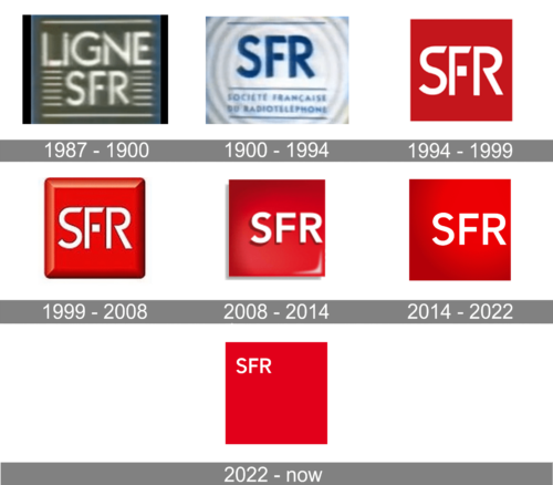
No matter how many modifications the SFR logo has undergone, it has always preserved its core: the three letters of the company name in a lean, elongated uppercase sans.
What is SFR
Established in 1987, SFR is a French company offering mobile communications and the internet. It is headquartered in Altice Campus, Paris, France.
1987 – 1990
The original logo already featured the letters “SFR” as one of its basic elements. If you compare the typeface with that used in later versions, you will notice quite a few similarities.
The letters are rather high. On the one hand, this makes them look unstable. On the other hand, such proportions are a great way to represent a telecommunications company. After all, companies of this type constantly work with telecommunications towers, masts, antennae, etc., and none of these structures are supposed to look stable. On the contrary, their height is one of the features connected with their functionality.
The original SFR logo also featured the word “Ligne” in a slightly more unique “split” typeface, as well as stylized signals.
1990 – 1994
There, the word “Ligne” was gone, which made the lettering “SFR” the center of the design. This time, it was colored dark blue. The typeface looks the same. Below, the writing “Societe Francaise du Radiotelephone” in smaller blue letters could be seen.
The signal theme from the previous logo was transformed – the “signals” now were represented by concentric circles in gray and white.
1994 – 1999
The design was simplified, which meant only the abbreviation was left. Gone were the gray “radio waves” and the small letters. As a result, the wordmark got all the attention.
It was now presented in white and placed inside a bright red square. The proportions of the letters were similar to the previous version, but there were quite a few new details. You can see it, for instance, in the straightened top of the “S” and its diagonal top end. The top end of the “F” was also cut differently.
Even more notably, the “F” was now made up of two parts, which made it similar to the style of the original logo.
On the whole, this version looked more vibrant and eye-catching, while also preserving the link with its predecessor. On the one hand, the logo wasn’t illustrative of the type of service the brand provided. On the other, there was no real need for this as the brand was already familiar to the majority of the population in its country.
1999 – 2008
Some depth was added to the emblem so as to make it look like a button. This result was achieved by using gradient and shades.
2008 – 2014
The “button” effect disappeared, but the emblem still has some dimension. The background seems concave, while the letters look embossed. Also, there is an effect that can be described as wet or glossy.
The shape of the glyphs was updated and now looked more like the 1994 version, with a curved “S” and solid “F”. However, it’s not an exact copy of the previous version.
2014 – 2022
The glyphs were slightly modified again. For instance, the top end of the “F” was eventually straight, not diagonal. The glossy effect was gone, but a subtle gradient could still be seen.
More notably, the letters became smaller in comparison with the box and weren’t centered anymore.
2022 – Today
The new version of the SFR logo was introduced in 2022 and is built in the same style as the previous badges, but looks much more modern and balanced. The badge is still composed of just two elements, a solid red square and a clean white lettering in a geometric sans-serif font, but unlike the version of 2014, there are no gradients, and the inscription is set in a very small size, placed in the upper left corner of the solid square.
Colors and font
The red hues dominating the design make the SFR logo capture your attention. While the type seems generic, it helps to connect the current logo with heritage versions


