Scratch is the name of the children-oriented website, specialized in programming and coding. The language was first introduced in 2003 by MIT Media Las and today is considered to be one of the best educational sources for kids in learning the code.
Meaning and history
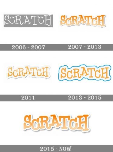
The visual identity of the Scratch programming language has had several redesigns throughout its history, but all of its five versions were based on a handwritten logo-type, which only changed its contours thicknesses and color shades.
2006 – 2007
The very first logo for Scratch was introduced in 2006 and only stayed with the brand for a year, as it was a monochrome badge with the inscription in all capitals in it. The lettering featured uneven lines and a playful serif typeface, which looked cool and progressive, pointing to the creativity and the children-oriented approach of the product.
2007 – 2013
The redesign of 2007 brought a new palette to the Scratch logo, and now it was ex-ecuted in gradient orange and white, where the main text featured orange lines, outlined in white, and with a distinct light gray shadow, which added volume to the logo, making in layered and three-dimensional. The contours of the letters were re-fined and now featured smooth solid shapes, though the jumping placement from the first version was kept in this one.
2011
In 2011 another version of the logo was created, but it was barely used by the brand. The logo featured the same orange and white color palette, but with thinner orange lines and the wider white part. The shadow was narrower than on the version, created in 2007.
2013 – 2015
The logo, designed in 2013, was based on the version from 2011, but with no gradient colors and gloss. The only new thing here was a smooth blue outline, which added brightness and contrast to a light and tender logo. The new palette made the Scratch emblem look fresher and bolder.
2015 – Today
The redesign of 2015 kept the style and contours of the previous version, but changed its color palette, making the logotype white and placing it inside a thick and solid orange badge, repeating the contours of the lettering. When placed on a colorful background, the badge gains a white outline, which makes it stronger and more visible.
Font and color
The handwritten playful Scratch typeface is a combination of a traditional typewriter-style font with its long serifs, and kids drawing, where there are no straight lines. The inscription looks friendly and funny, being memorable and recognizable by kids and parents all over the globe.
The orange and white color palette symbolizes energy, warmth, and progress, re-flecting the purpose of Scratch and its mood. This color combination is soft and tender, yet also dynamic and progressive, standing for growth, development, and fun learning.


