The AHL team San Antonio Rampage is the top affiliate of the NHL’s club St. Louis Blues.
Meaning and history
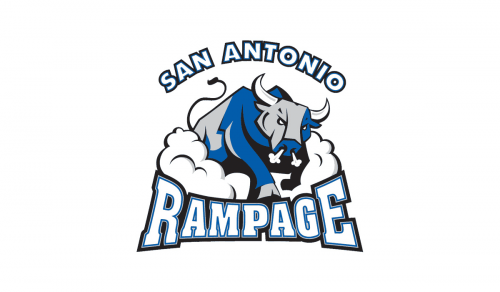
The logo unveiled before the 2002/03 playing season sported a fierce-looking bull blowing smoke through his nose. The two parts of name of the team were positioned above and below the bull.
In 2006, the club updated the color scheme of the emblem replacing blue with dark grey and altering the shade of silver that was already present on the design. The shape and position of the elements remained intact.
1972 – 1975

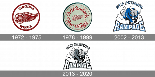
The history of the club started at the beginning of the 1970s when the team appeared under the name Virginia Wings. The first logo was created in 1972 and stayed with the club for three years. It was a simple and clean circular badge with a white background, red outline, red-winged wheel in the center, and two arched letterings — “Virginia” in all capitals above the wheel, and “Wing” under it.
1978 – 1999

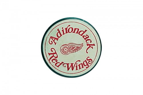
The name of the club was changed in 178, and the new season they started was Adirondack Red Wings. The logo remained more or less the same — the wheel with the wings stayed as the main symbol of the badge, although it became smaller and was now placed on a light green, close to mint, circle in a dark green outline. As for the wordmark, it was enlarged and switched its typeface from simple sans-serif to an ornate cursive font, with elongated lines and curved tails.
2002 – 2013

The name San Antonio Rampage first appeared in 2002, and in the same year, the new logo was designed. It was a modern and cool badge in a white blue and gray color palette with a huge aggressive bull in the center of the composition. The wordmark was split into two parts — the bold outlined “San Antonio” in white, blue, and black, was arched above the animal, and the “Rampage” in all capitals with the first and last letters enlarged was written in a square massive serif font under the Bull.
2013 – 2020

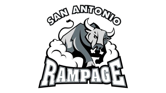
The redesign of 2013 switched the color palette of the Rampage logo to white, gray, and black. Now the badge looks stricter and more masculine, evoking a sense of power, professionalism, and confidence and at the same time showing the timeless values of the team. All of the elements on the logo had their contours cleaned and strengthened.
Colors
Noble and discreet, the monochrome color scheme of the San Antonio Rampage logo includes black, dark gray, silver, and white. The color choice helps to add volume and make the emblem look more like a 3D one.


