Saint Laurent is the name of a luxury fashion and cosmetic brand, which was established in France in 1961, and named after its founder, a famous designer Yves Saint Laurent. This brand is a real icon in the history of fashion and is considered to be one of the chicest and elegant. Today YSL is owned by Kering and has a yearly revenue of more than one billion USD.
Meaning and history
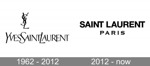
The visual identity of the legendary french Maison du mode has been very consistent until 2012 and was composed of an elegant logotype with a monogram as the brand’s signifier. The two elements could be used together, of the monogram was placed on its own on the perfume bottles or fashion tags. the concept was changed with the new creative director of the brand.
1962 — 2012
The original logo for Yves Saint Laurent featured a monochrome composition with the wordmark and an emblem, formed by just three letters of the designer’s name, YSL. The logotype in the uppercase has the first letters of each part enlarged. As for the typeface, the Yves Saint Laurent visual identity is executed in a custom sans-serif font, which looks a bit close to New Yorker, but with lines modernized and elongated. In terms of spacing, the three parts of the designer name are placed close to each other, with no additional separating.
The YSL emblem, which is one of the most recognizable fashion symbols in the world, boasts three intertwined capital letters, written in the same typeface as the wordmark, but with bolder lines.
The monochrome color palette of the Yves Saint Laurent logo could sometimes be replaced with gold letters and emblem, but a timeless and elegant black-and-white combination is what is associated with in the first place.
2012 — Today
The redesign of 2012 was held after the name of the famous fashion house was shortened to just Saint Laurent. The new concept is built around the new brand’s name, written in bold sans-serif letter, and a more elegant “Paris” in a different typeface.
The upper line of the logo had its letters in Neue Helvetica enlarged and clean, while the “Paris” tagline, also in the uppercase, is executed in a modern serif typeface which is pretty similar to Copperplate Gothic Std Bold, and has its letters placed far from each other, which adds air and lightness to the image.


