Rosetta Stone is an American software company, which creates educational programs since 1992. The company is mainly focused on linguistics and humanity disciplines.
Meaning and history
Rosetta Stone is one of the most effective programs for learning foreign languages. The main principle of learning is a kind of immersion in the language environment.Thanks to the program, you can learn more than thirty languages. In English, tasks are available at all five levels of difficulty. Words are studied first, then sentences are constructed.
Allen Stoltzfus came up with the idea for such a program back in the 1980s, but it was not until 1992 that the first steps were taken, thanks in large part to the arrival of suitable technology in those years. Allen and his half-brother John Fairfield founded Fairfield Language Technologies in Harrisonburg, Virginia, and his brother Eugene Stoltzfus joined the effort.
In 2006, the company was acquired by the investment firms ABS Capital Partners and Norwest Equity Partners. At the same time, the company was renamed Rosetta Stone.
The company’s name was chosen in honor of the famous artifact – the Rosetta Stone, inscriptions carved on it, made simultaneously in Ancient Greek and Egyptian hieroglyphs, allowed to find a method of deciphering the mysterious Egyptian hieroglyphs.
What is Rosetta Stone?
Rosetta Stone is the name of a famous American developer of education software; which was established in 1992, and today is still considered to be one of the most popular and effective companies in this segment. The software of Rosetta Stone is focused on humanitarian disciplines.
1992 – 2007
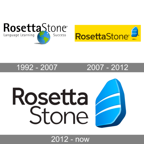
The very first logo for the educational software was introduced in 1992 and stayed with Rosetta Stone for fifteen years. It was a black inscription in the title case, executed in a traditional and even boring sans-serif typeface, with a lowercase tagline, also in black, and a blue and green globe, drawn in a three-dimensional manner; and placed under the main wordmark, separating the tagline into two parts.
2007 – 2014
With the redesign of 2007, the software adopted the iconic emblem we still can see today on its logo. The stylized gradient blue image of the real Rosetta Stone was placed on the right from the sand-serif logotype in black stable sans-serif, put on a solid yellow horizontally stretched rectangularly. That was a very bright badge, though it looked pretty stable and serious despite the strong contrast of yellow and blue.
2014 — Today
The software company was named after a steel stone from Ancient Egypt, which was found in 1799 and today is being exposed in the British Museum. This historical link shows the brand’s profile as an educational-software developer.
The Rosetta Stone logo is composed of a wordmark and an emblem on its right. The wordmark is written in two levels and uses the different thicknesses of the lettering.
The upper, “Rosetta”, the part is executed in a bold sans-serif typeface with thick rounded lines, while the bottom “Stone” part features thinner and lighter shapes.
The Rosetta Stone emblem is a three-dimensional figure which repeats the shape of the historical Egyptian stone. It is placed half-turn and looks like it is levitating.
The bright blue and white color palette of the Rosetta Stone emblem is a reflection of a professional education-centered brand that values progress and innovations.
It is a strong and bright logo that is highly recognizable and is a great representation of such a reputable company.
Font and Color
The two-leveled lettering from the primary badge of Rosetta Stone is set in a title case of a clean modern sans-serif typeface, with the top level in bold lines, and the bottom — in medium-thick ones. The closest fonts to the one, used in this insignia, are, probably, Cynthia Next, or Mirai Medium, but with some modifications (the top ends of the T-bars are cut diagonally).
As for the color palette of the Rosetta Stone visual identity, it is based on a clean and professional combination, made up of blue, white, and black. Blue is the color of protection and stability, while white elements accent loyalty and trustworthiness, and black — is for professionalism and reliability.


