CenturyLink is an American communications technology company, created in 1930. Today the company is a technology leader, which delivers hybrid networking, cloud connectivity, and security remedies to clients across the globe.
Meaning and history

CenturyLink was established in 1930 as Oak Ridge Telephone Company a local Louisiana business. Oak Ridge Telephone Company founder F.I. Hogan sold the company to William Clark and Marie Williams when it had only 75 subscribers. The price of the deal was 500 USD, which was not such small money at the time. The new owners of the telephone company moved the telephone switchboard into the living room of Williams’ house, where they began operations.
In 1946, Williams’ son, Clark McRae, received the Oakridge Telephone Company from his mother as a wedding gift.For a long time, the company retained its “family” status until it grew into a corporation in 1968 After the total number of Oak Ridge Telephone Company subscribers exceeded 10 thousand in 1967.
The change in status entailed a name change as well. Oakridge Telephone Company was renamed Central Telephone and Electronics, and in 1971 Century Telephone Enterprises, Inc. By 1999, the company changed its name again to CenturyTel. Under that name, the operator continued its expansion. After buying Embarq in 2008, the company changed its name to CenturyLink.
For a long time, CenturyLink was one of the top three networks in the United States, behind AT&T and Verizon Communications.
What is CenturyLink?
CenturyLink is the former name of Lumen, one of the American Fortune 500 companies, engaged in the telecommunication segment. The company was established in 1930, and today is one of the global leaders in the provision of network and cloud security services.
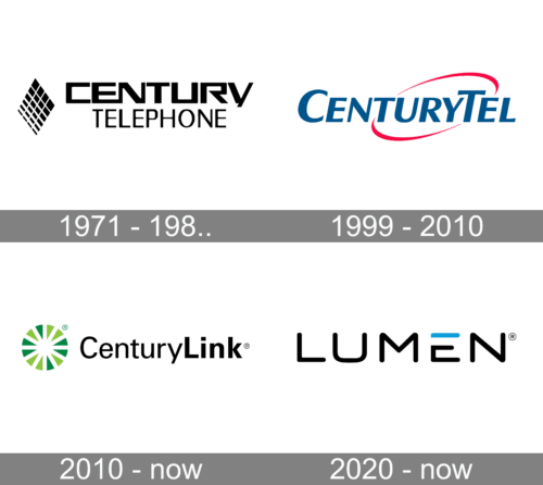
1971 – 1980s

The original CetnturyLink logo reflects the old name of the company, Century Telephone. Here, the two words are positioned one above the other. “Century” is bolder and features a more unusual type. The space between the glyphs is scarce, and the “E” even forms a single glyph with the “N.” This conveys the “telecommunications” theme.
The emblem to the left of the wordmark is a parallelepiped made up of multiple smaller rhombuses.
1999 – 2010

The brand was renamed “CenturyTel” and adopted a dramatically new logotype. This time, the name of the company was placed within a single line. The type was a more generic sans. It featured all-caps glyphs formed by strokes of various thicknesses. There was a dynamic red ellipsoid in the background.
2010 – Today

The Century Link visual identity is bright yet strict and professional. The brand’s logo is composed of a wordmark with a colorful emblem on its left.
The wordmark is executed in a sans-serif typeface with two parts using a different thickness of the lines. The “Century” is written in fine light letters, while the “Link” is bold and strong.
The black color of the Century Link inscription adds a sense of power and dignity to the logo, making it timeless at the same time.
The Century Link emblem is a circle, consisting of twelve triangles, which feature two different shades of green. The color of the brand’s symbol reflects the energy and progressive approach of the company, making the logo bright and memorable at the same time.
The Century Link logo is modern and minimalist, yet instantly recognizable due to the use of bright green color. Its plainness only makes it stronger and more stylish and evokes a sense of reliability and expertise.
2020 – Today
Lumen, the new name, is printed in bold, sans-serif font similar to Quadrillion Light. The font features rounded ends and smooth curves, creating a welcoming impression that promotes communication. The logo is done using a black color, which is a classic choice. To add uniqueness to the logo, the upper horizontal bar in the “E” is done in sky blue. This color is often used in the communications industry and is closely linked to reliability, safety, and trustworthiness.
Font and Color
The modest and traditional title case lettering on the official CenturyLink logo is set in a clean and simple sans-serif typeface, with the two parts of the wordmark set in lines of different thicknesses. The closest fonts to the one, used in this insignia, are, probably, Iwata Gothic Old Pro, or Univers Cyrillic 55 Roman.
As for the color palette of CenturyLink’s visual identity, it is based on two shades of green, with the lighter one standing for growth and progress, and the darker one — for stability, excellence and success. The black lettering on the badge adds a touch of elegance and timelessness to this modest logo.


