Although the Rolex logo is more than a century old there have been almost no amendments to its shape and proportions, except for minor ones.
Meaning and history
The visual identity history of one of the world’s most famous watch manufacturers has been pretty strict and modest, with only three emblems created throughout the years. Its iconic logo has been with Rolex for decades and is instantly recognizable in every corner of the world.
What is Rolex?
Rolex is the name of one of the most famous luxury watchmaking companies in the world, which was established at the beginning of the 20th century, and by today has become a synonym of luxury and wealth, the benchmark of style among the watches.
1905 – 1965
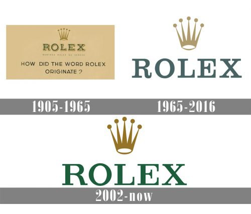
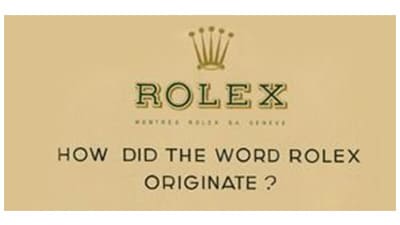
The original Rolex logo was introduced in 1905 and featured a light cream background with the solid serif inscription in green with a distinct outline and delicate shadow. Above the inscription, there was a sophisticated golden crown placed with five elongated peaks.
1965 – 2002
The logo was redesigned in 1965z the composition and color palette remained almost untouched, the shades of gold and green were just slightly muted and lightened up. The typeface of the lettering was also a bit refined, and on the new emblem, the wordmark looked more elegant and tender, without any outlines and shadows.
2002 – Today
The redesign of 2002 made the colors of the official Rolex palette more intense and delightful. The brand starts using a bright forest green for its logotype, which was rewritten in a new more confident serif typeface. As for the crown, its contours remained untouched, though the gold-tone was elevated and darkened.
Meaning behind the symbol
The logotype comprises two key parts: the crown image and the typographical wordmark. Both of them have their unique meaning.
The crown has always been a symbol of honor and prestige, and this goes well with the core values of the Rolex brand. The company’s history preserved no record as to whether there were any additional reasons for the co-founders to opt for this emblem. However, there are quite a few hypotheses. One of them states that the crown symbolizes the human hand, referring to the number of points of the crown as a proof. Another hypothesis suggests that the design represents tree branches topped in pearls.
Font
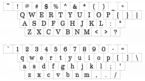
The Rolex insignia is based on the Garamond typeface, but some of the characters have been modified so as to make the logo more unique.
Color
The combination of gold and green has been present in the Rolex logo throughout most of its history. The golden crown emphasizes the fact that the company focuses on precious materials, while green may be interpreted as the color of money, a symbol of richness and prosperity.


