Rieker is a German brand of a footwear manufacturing company, which was estab-lished in 1874. Today the company produces not only shoes but also bags and leather accessories and has its products distributed all over Europe.
Meaning and history
The Rieker visual identity is a tribute to the company’s heritage and legacy. Based on the floral motive of the ancient coat of arms of the Rieker family, the logo looks modern and bright.
The red and white color palette of the Rieker logo is also a tribute to the brand’s founder’s history — it replicates two main colors of the Rieker family’s coat of arms, and symbolize passion and power.
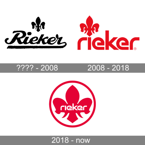
???? – 2008
2008 – 2018
2019 – now
The Rieker logo is composed of a wordmark, placed into a circular emblem. The in-scription in all the lowercase letters is executed in a modern sans-serif typeface where all the letters except for “K” have smooth lines with rounded corners. The let-tering looks progressive and contemporary and creates a great balance with a clas-sical emblem.
The Rieker emblem is composed of a red stylized Fleur de Lys symbol, enclosed in a circular frame. The image looks sleek and modern, yet shows the company’s respect and value of its roots.


