While the history of the Richmond Tigers football club started in 1885, the earliest known emblem dates back to 1946. It’s a roundel monogram in black, yellow, and gold. At the center, the interlacing letters “P,” “F,” and “C” can be seen. Below, there’s the number “1946.” The monogram in gold is placed in an intricate shape with the gold outline and yellow filling. The shape is encircled by the words “Richmond football club” in gold over the black background.
Meaning and history
Richmond Tigers, or Richmond Football Club, is a professional Australian football club, which was established in the middle of the 1880s and today is one of the top 10 strongest football clubs in its country.
Since the very first years, the “Tigers” nickname stuck to the club, affecting its identity, and the yellow and black color palette of the Tigers’ uniforms.
What are Richmond Tigers?
Richmond Tigers is the nickname of the Richmond Football Club, a professional rules football team, established in Australia in 1885, which makes it one of the oldest football clubs in its country. The club has the Melbourne Cricket Ground as its home arena and Damien Hardwick as the head coach.
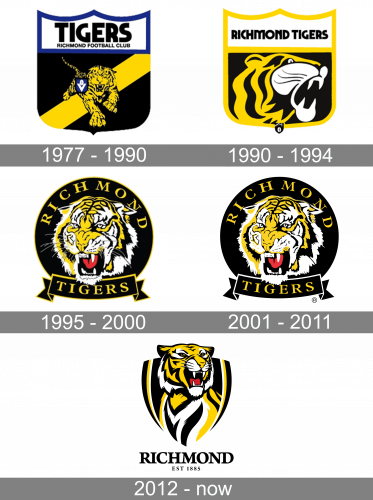
1977 – 1990
The Richmond Tigers logo from the end of the 1970s featured a heavy black crest with a white top part with three peaked and a blue outline. The white banner had a two-leveled “Tigers Richmond Football Club” inscription in black, while the crest itself had a bright yellow and black image of a walking tiger and a thick diagonal stripe in yellow.
1990 – 1994
The redesign of 1990 has removed the blue lines from the Richmond Tigers badge, replacing them with yellow ones. The Tiger was completely redrawn and now it was an enlarged head of an animal, placed in profile facing to the right. The lettering on the white banner was replaced by a bold uppercase “Richmond Tigers” in a cool modern font.
1995 – 2000
In 1995 the Richmond Tigers badge was redesigned again, and this is when the crest shape of the badge was replaced by a circular one. It was a solid black roundel with the head of the aggressive tiger drawn in the center. The yellow uppercase lettering in a classy serif font was written around the perimeter of the logo, with the “Tigers” lettering set along the ribbon, placed at the bottom of the badge.
2001 – 2011
The Tigers logo, created in 1995 was slightly refined at the beginning of the 2000s, with the colors intensified and the contours of all elements strengthened and cleaned up.
2012 – Today
Each Richmond Tigers logo that has appeared since the 1980s has featured a tiger. The earliest of them (1977-1990) is a shield depicting a tiger walking forward. While there’s certainly an accent on the muzzle, you can see the creature’s body, too. On the background, there’s a black field with a yellow diagonal stripe. Above, you can see a white field with a dark blue outline housing the text “Tigers” in larger letters and “Richmond football club” in smaller letters.
Symbol
In 1989, a new logo was unveiled. Here, the picture was reduced to the tiger’s head on the black field. The lettering was also cut leaving only the words “Richmond tigers.” While the shield shape was preserved, it became somewhat simpler. The same with the palette: the blue was removed leaving only three colors (white, yellow, and black).
The 1995 logo was much richer in details: the tiger had a lot of stripes and wrinkles and a distinctive red tongue. From the one hand, this approach made it more realistic, while from the other, the emblem worked worse at smaller sizes. What was even worse, it bore a funny resemblance to the logo of the Hollywood film studio Metro-Goldwyn-Mayer.
Colors
The official palette comprises yellow and black, while the Richmond Tigers logo itself also features red and white. The addition of the two colors seemed necessary to create a more or less realistic design.


