Random House Home is the name of a former subsidiary of the famous Random House publisher. The subsidiary was established in 1983 and specialized in the production of movies and cartoons based on the books of the publishing house. Among the most famous shows, introduced by Random House Home were Sesame Street and Arthur series.
Meaning and history
Established by Penguin Random House, a publishing house with a rich history and a very strong background (founded in 1927), the Random House Home Video was a video-production subsidiary, responsible for creating video content that visual used the most famous novels and book series, published by the mother-brand.
1983 – 1984
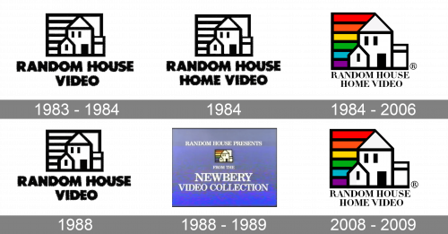
The very first logo for the video department of Random House was created in 1983 and stayed in use for just a few months. It was a strong and confident badge in the black and white color palette, with the extra-bold uppercase wordmark in sans-serif set in two levels under the emblem, depicting a house and enclosed into a rectangular frame with a horizontal striped pattern on the left. The On-screen variant of the logo featured that striped part colored in red, orange, yellow, green, blue, and purple, the whole rainbow palette.
1984
The redesign of 1984 was only about the lettering on the badge. As the original logo featured the “Random House Video” inscription, and with the name change, it became the “Random House Home Video”. This, the lines of the letters became a bit thinner than on the previous badge, in order not to overweight the composition, and for the wordmark to stay distinct and visible. As for the graphical part, it remained completely untouched.
1984 – 2006
A more elegant version of the logo was introduced by the company at the end of 1984. The lettering got a new serif typeface with tall letters and sharp serifs on the ends of the bars. The graphical part of the badge was also refined, getting the contours of the house slightly stretched vertically. Another important thing was about the color palette, as now the rainbow on the official primary version was colorful, not monochrome.
1988
For just a couple of months, the company has been using the badge, created in 1983, with the shortened version of the lettering and the iconic geometric image of the house with a horizontal rainbow on the side.
1988 – 1989
Another short period (from the middle of 1988 to the beginning of 1989), the logo of the production company was set on a light purple background, with the lettering set in white, and the emblem in its original state, with the bright rainbow on the left.
2008 – 2009
For the final months of its existence, Random House Home Video came back to its most elegant and sophisticated badge, the one, that was created in 1984, with the smooth serif typeface for the two-level inscription, tall contoured house, and wide and strong horizontal rainbow element.


