For a long time, rock bands from all over the world tried to find a new direction, but no one succeeded until the mid-1970s. It was then, in 1974, that a new band, the Ramones, formed, who became the progenitors of punk rock and coined the famous “Hey! Ho! Let’s go!” Motto. The name “Ramones” was suggested by the bassist of the newly formed band, Dee Dee (Douglas Colvin), and before him, the name was used by Paul McCartney, back when his band was called “Silver Beatles”. And the band’s visual identity, which has never been dramatically changed, has become somewhat much more than a simple insignia. Until today, the Ramones’ elegant circular badge is a symbol of the punk-rock genre.
Meaning and history
All the members of the legendary band changed their last names to Ramone, so that they sounded like one family, however none of them were biologically related.
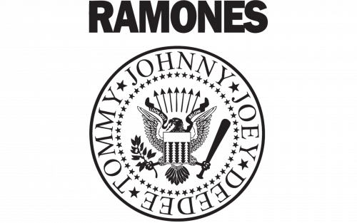
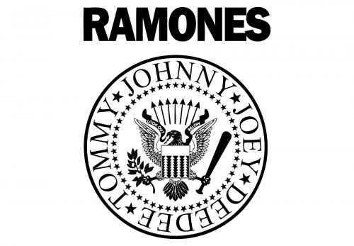
The Ramones logo is considered to be one of the strongest visual identity works in music history. It is composed of a round emblem with a heraldic eagle in the center and the names of the member around its perimeter, and the wordmark above the emblem.
The famous logo was designed by Arthuro Vega, who was the band’s creative director.
What is Ramones?
Ramones is the name of the legendary rock band from New York, that created the punk rock music genre. However, the band didn’t achieve commercial popularity in their lifetime but became a widespread cult following the death of their founding fathers. The pinnacle of the Ramones’ popularity on the US chart was the song “Rockaway Beach” from the 1977 album Rocket to Russia.
1975 – 1996
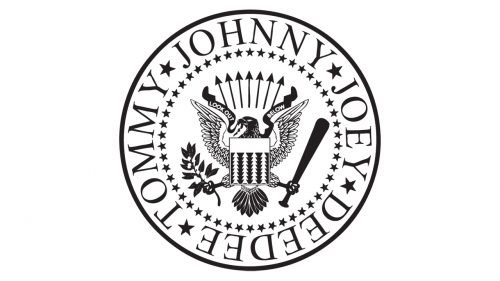
The eagle on the Ramones emblem is the US presidential seal and it represents the band as an all-American. The eagle holds a baseball bat, which symbolizes one of the musician’s passion for baseball.
In the other talon, the eagle holds an apple-tree branch, which is the graphical representation of Arthuro Vega’s words “Ramones are like an American Apple Pie”.
It is a very strong visual identity, with a lot of meanings in it and the timeless iconic design.
Font and color
The main bold and distinctive lettering from the primary logo of the Ramones band is set in a clean geometric sans-serif typeface, which looks very similar to such commercial fonts as Franklin Gothictrade and Ryman Gothic, with minor modifications. As for the elegant serif inscription in the circular medallion on the badge, it uses a classy font, which has a lot in common with such types as Odyssey Protrade and Bustanitrade.
As for the color palette of the Ramones visual identity, it is usually executed in the most laconic black-and-white scheme but is sometimes accompanied by bloody-red characters, making up a more passionate and strong image.


