Rakuten is a Japanese online marketplace, which was established by Hiroshi Mikitani in 1997. The e-commerce platform is considered to be one of the biggest in the world and has more than one billion users across the globe with its operations in almost 30 countries.
Meaning and history
The visual identity of one of the largest world’s marketplaces has always been based on Japanese traditions. Its logo, executed in the colors of the national flag, looks powerful and modern.
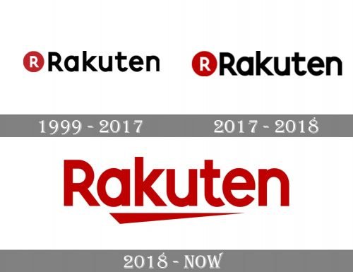
1999 — 2017
 The original logo of the company featured a solid red circle on a white background, just like the flat of Japan and its rising sun symbol. The delicate white lettering “Rakuten Ichiba” in a hieroglyphic style typeface was placed on the circle and split into two levels. The name of the corporation was written in Japanese on both sides of the emblem, using black color.
This traditional and elegant logo was a tribute to the company’s roots and legacy, showing it as a powerful and serious platform with a fundamental approach to business.
2017 — 2018
The first redesign of the Japanese marketplace’s visual identity was held at the beginning of the 2000s. It brought a more contemporary and powerful look to the company’s logo, accenting on progress and innovations.
The new Rakuten logo was composed of a black wordmark with a rounded emblem on its left. The emblem was used as the brand’s signifier and as a web and mobile app icon.
The insignia of the platform depicted a red solid circle with a white letter “R” in the middle. The signature “R” was written in a bold sans-serif typeface with clean strong lines.
2018 — Today
The latest redesign of the logo removed the black color from the palette, the circle was replaced by the new company’s symbol.
The current logo is composed of a red wordmark with a triangular red underline. The triangle has its right part thin and elongated, pointing forward and reflecting the progress of the company, its willingness to move and grow.
Font
The wordmark is executed in a bold custom typeface, which is pretty close to QUARVIC family font, a strong sans-serif, evoking a sense of protection and reliability.
The nameplate looks professional and shows the company as trustworthy and energetic, the one providing brilliant results and have a perfect reputation.
The inscription is well-balanced and clean, all the letters are solid and harmonized, creating a sense of authority and expertise.
Review
The main Japanese marketplace offers one of the hugest ranges of products in Asia to its customers. The global market’s catalog includes such categories as fashion, baby products, beauty items, electronic devices, goods for home and kitchen along with various accessories for cars and bikes.
The e-commerce platform ships orders to almost all the countries across the globe and has flexible delivery rates depending on the preferred service providing company. As for the payment methods, the marketplace accepts all the possible credit cards along with PayPal and Alipay systems and bank transfers.
Being the home for more than 10 thousand of Japanese shops, Rakuten offers best deals on high-quality products, and has a perfect reputation across the world, providing the best customer support service and running discounts and special offers for its clients.


