RAF, also known as Riga Autobus Factory, is an automaker company originally established in Latvia. The company specialized in producing buses and commercial vehicles. Once a subsidiary of the Soviet automotive industry, it later went through several ownership changes. The company primarily operated in the Baltic states, the CIS countries, and other parts of Europe. Although the company has faced challenges, including economic downturns, it is a recognizable name in the field of vehicle manufacturing in the region.
Meaning and history
RAF, short for Riga Autobus Factory, was founded in 1949 in Latvia. Originally under Soviet governance, the company specialized in manufacturing buses and other commercial vehicles. Notable achievements include the production of the iconic RAF-977 minibuses, widely used in the Soviet Union and its satellite states. The company also modernized its lineup with newer models, like the RAF-2203 “Latvija”, to adapt to market needs. Despite its historical significance, RAF has faced financial hurdles and ownership changes over the years. The company was largely inactive, representing a bygone era of Soviet and Latvian automotive history.
What is RAF?
RAF (Riga Autobus Factory) is a Latvian automaker company originally founded in 1949. It specialized in producing buses and commercial vehicles, primarily serving markets in the Baltic states and the CIS countries. The company was largely inactive, symbolizing a past era of automotive manufacturing in Latvia and the Soviet Union.
1949 – 1959
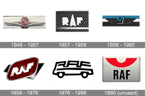
The brand designed a winged emblem with a heraldic shield in the center. Both are typical elements for automobile brands. The emblem is done in gray and crimson. The crimson color is used for the center of the shield as well as a few other small details, while the wings, name, and border around the shield. The latter had RAF, which stands for Riga Autobus Factory, printed in gray using a bold, sans-serif font. The initials are aligned on a diagonal going from the upper left corner. The free space is filled with wavy lines, which refer to the closeness of the Baltic Sea to the country of origin. The bottom also has “Riga” printed in smaller, red font, which also specifies where the brand comes from.
1957 – 1959
The new logo was a much simpler design that consisted of only an “RAF” wordmark. The designers used a different sans-serif font that featured bold lines and no cutouts in the center. The latter allowed the name not to get lost on the automobile or any other place the logo is featured on. The white color and rather dark backdrop helped with that.
1958 – 1960
This logo version is closer to the original one as it has an elongated shape with an emblem in the center. It was done in the black and blue color palette, which made the brand appear strong and trustworthy. The logo was framed by blue and black stripes above and below the shield with the name, respectively. Thanks to an outline, the shield and the wing appeared to have volume. The trapezoid shield was done in black and had the initials, which were now placed at the top with the “A” dropping slightly lower. The logo turned out quite dark and heavy, which might be appropriate for a company that specializes in large vehicles.
1959 – 1976
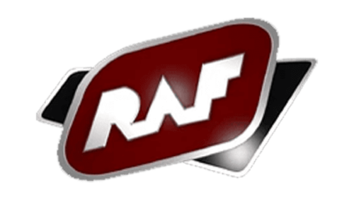
This logo looks a lot cleaner and well-designed. The company used carmine red, the national color of Latvia. It was complemented by black, white, and silver. The logo creators used abstract geometric shapes with a black behind a carmine red parallelogram placed on a diagonal in the front. The name was printed using a modified version of the font introduced in 1957. The white color of the inscription was a perfect contrast to the deep red.
1976 – 1998
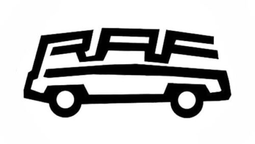
The logo acquired a rather playful tone as it was a stylized car. The automobile’s top was the name formed from a single line. The automobile also had two circles for wheels and a horizontal line for the body. It was a simple, black-and-white design that the company used for a little over twenty years until it had pretty much seized its activity.
1990 (unused)
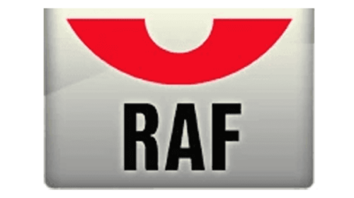
The company also had this logo created for it, but it never got used. The logo had a rectangular shape with a light beige and gray gradient. A red half-circle with a smaller one cut out at the top was placed at the top of the logo, adding a bright and bold detail. The name was printed using a rather basic, sans-serif font of a black color.


