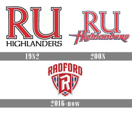
The teams representing Radford University in intercollegiate athletics are nicknamed Radford Highlanders. They have a pretty complex and difficult to reproduce logo.
Meaning and history
Founded alongside Radford University in the early 20th century, the Radford Highlanders emerged as a symbol of athletic prowess in Virginia. This athletic division, embracing the spirit of the university’s establishment in 1910, has carved a niche in collegiate sports under the banner of the Big South Conference. A focal point of their journey lies in the achievements of the basketball teams. The men’s basketball squad, known for its dynamic play, has etched its name in the annals of the NCAA Tournament. Not to be outdone, the women’s basketball team has showcased remarkable skill, earning multiple berths in the NCAA Tournament. Beyond the hardwood, the men’s soccer team has brought laurels to the university with their consistent performances, marked by conference triumphs and NCAA appearances. Currently, the Radford Highlanders continue their pursuit of athletic excellence, upholding a legacy that blends tradition with a relentless drive for success.
What is Radford Highlanders?
Radford Highlanders is the name of the athletic program from the Radford University, located in Radford, Virginia. The program consists of 15 men and women teams in various sports disciplines, including basketball, golf, soccer, and many others.
1982
The Radford Highlanders logo from 1982 featured a simple yet confident and elegant badge in black, red, and white, with the “RU” lettering enlarged and making the main part of the composition. The two letters were written in a bold red modern serif font and outlines in white and black contours of the same width. The elegant and smooth letters with square serifs were placed above the “Highlanders” inscription in the black stylized typeface. The bottom line of the wordmark had its letters wide and very balanced in terms of spacing.
2008
The redesign of 2008 kept the color palette and the composition of the previous version and even left the upper “RU” line of the logo almost untouched. All the main changes were made to the bottom, “Highlanders”, part. Now it was redrawn in a custom handwritten typeface with thick elongated lines in the same combo — thick red outlines in white and black. The first “H” was overlapping the “R” above it. As for the “RU”, its style remained the same as on the logo from 1982, but the lines became a bit thinner and smoother.
2016 – Today
The current Radford Highlanders logo was introduced in 2016. It is based on the shield shade. In the very center, there is a large stylized letter “R” placed inside a red flag. The lower half of the sword is filled with a geometric pattern in red, blue, and white. The word “Radford” can be seen above the “R.” The letters are red, while the background is white.
Radford Highlanders Colors
RED
PANTONE: 186
HEX COLOR: #C2011B;
RGB: (194, 1, 27)
CMYK: (10, 100, 90, 0)
GRAY
PANTONE: 427
HEX COLOR: #D1D3D4;
RGB: (209, 211, 212)
CMYK: (0, 0, 0, 20)
BLUE
PANTONE: 541
HEX COLOR: #003C71;
RGB: (0, 60, 113)
CMYK: (100, 50, 9, 46)
CMYK: (0, 0, 0, 0)
WHITE
PANTONE: P 1-1 C
HEX COLOR: #FFFFFF;
RGB: (255, 255, 255)
CMYK: (0, 0, 0, 0)


