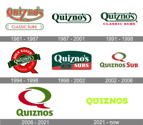
Over its almost 40-year history, the Quiznos logo has gone through around four overhauls. There seems to be nothing in common between the original logo and the current one, apart from the emphasized “tail” on the “Q.”
Meaning and history
Quiznos, a renowned fast-food restaurant chain specializing in toasted submarine sandwiches, was founded by Jimmy Lambatos in Denver, Colorado, in 1981. Its rapid growth and unique approach to sandwich preparation, distinguishing itself with toasted subs unlike its competitors, marked its early years. By 1995, Quiznos had established over 100 locations, and by 2005, the number soared to over 4,500 stores across the United States. This period of expansion solidified Quiznos as a major player in the fast-food industry, particularly known for its innovative menu items and aggressive marketing strategies.
However, the company faced significant challenges in the late 2000s, including franchisee disputes and stiff competition from other fast-food chains. Despite these hurdles, Quiznos continued to innovate, introducing new menu items and focusing on quality ingredients. In recent years, Quiznos has undergone significant restructuring to strengthen its market position. This included store closures to reduce costs and an increased focus on international markets. As of now, Quiznos operates a substantial number of locations worldwide, continuing to serve its signature toasted subs, and remains a recognized brand in the fast-food industry.
What is Quiznos?
It’s a global fast-food chain famous for its toasted submarine sandwiches, offering a unique blend of quality ingredients and innovative flavors.
1981 – 1987
The first Quiznos location started working in Denver, Colorado, in 1981. The three most notable letters were the initial “Q,” the “Z,” and the final “S.” The “Q” had its “tail” stretched far beyond its normal size – it reached the lower end of the “S,” so the two characters formed a single glyph. The “Z” was also stretched downwards.
The logo was given in a vivid shade of light green.
1987 – 2001
While the overall style remained unchanged, there were a lot of subtle modifications. The color grew somewhat lighter, the weight of the letters also became lighter. While the “Q,” “Z,” and “S” still looked unusual and had extended ends, their shape was different.
1991 – 1998
The name “Quizno’s” was colored dark green. You could see a couple of very subtle alterations in the shape of the letters. Below, the lettering “Classic Subs” in red was added.
1994 – 1998
A roundel logo was adopted. The roundel was in fact a large red “Q.” The name “Quizno’s” was written in white across a dark green banner placed in the middle of the “Q.” The red ring of the letter, in its turn, housed the text “Oven Baked” and “Classic Subs.”
1998 – 2002
This time, the logo was based on a square with rounded corners and a rounded “roof.” The shape was divided into two asymmetric fields. The top field (dark green) housed the word “Quizno’s,” while the second field (red) housed the word “Subs.” There was also an icon featuring a stylized sub and the lettering “Oven Baked Classics.”
2002 – 2006
This Quiznos logo looks very much like the current one. There is a large “Q” in red and warm green paired with the lettering “Quiznos Sub.”
2006 – 2021
The word “Sub” disappeared, while the colors were slightly modified.
2021 – Today
The logo is a graphic representation of the Quiznos brand, featuring the company name in a bold, sans-serif typeface. The letters are rendered in a vibrant shade of lime green that conveys freshness and energy, perhaps to reflect the fresh ingredients of their menu offerings. Each character stands tall and flush with the next, with no spacing, signifying a modern and streamlined approach that resonates with contemporary branding trends. The initial letter “Q” is distinctive, with its tail curving underneath the rest of the letters, giving the logo a unique touch that aids in brand recognition. The simplicity of the design allows for versatile usage across various platforms, from storefront signage to digital media. The color choice of green not only symbolizes health and vitality but also works to stand out in the competitive food industry, hinting at the brand’s commitment to providing quality, flavorful, and toasty sandwiches. This logo effectively serves as the visual identity of the Quiznos brand, encapsulating its essence in a clear, memorable fashion.
Font and color
The Quiznos logotype, placed under the emblem on the badge, is executed in a stylish and modern serif font with rounded elements balanced by geometric and sharp serifs. The progressive typeface was created exclusively for the brand, though it is pretty close to such fonts as FS Lola Extra Bold and Kobenhavn C Black with some lines modernized.
As for the color palette of the logo, Quiznos uses a pretty strict and modest combination of green and red, which works great together of reflecting the character and individuality of the brands representing its progressiveness, passion, and success.


