Quizlet is the name of the educational portal for kids, oriented on science. The app was introduced in 2007, two years after its creation, and today is used by many learning centers, as has a wide range of games and tools, making the study process fun and easy.
Meaning and history
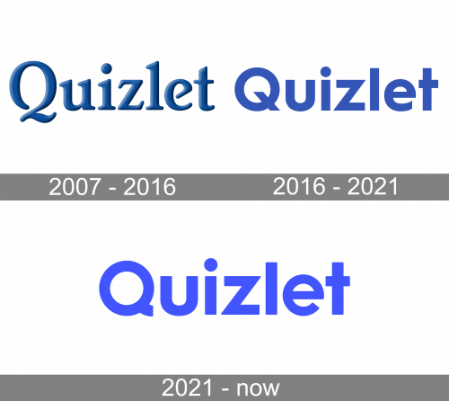
The Quizlet visual identity has always been very correct and discreet, its blue logo-type was redesigned just once, keeping the color palette and simplicity as its main distinctive features.
The educational portal, specialized in quizzes and questions, contains a huge amount of information, which helps children of different ages in learning about sciences and the world around us, so the simplicity of the Quizlet logo is a sign of professionalism and quality, which emphasizes on the extension of knowledge, without any visual distractions.
2007 – 2016
The very first Quizlet logo was introduced in 2007 and stayed with the brand for al-most ten years. It was a calm blue logotype in two levels, with the “Quizlet” inscrip-tion enlarged, and a small “.com” in the lowercase placed under its right part.
The elegant serif letters of the wordmark featured a very thin outline and delicate shadow, which made the logo voluminous and sleek. The capital “Q” had it’s tail elongated and curved, making the letter look like the number “2”, and adding a touch of traditionalism and sophistication to the whole inscription.
The typeface of the original Quizlet logo was very similar to the Brighton family fonts, very delicate and fancy, with bold serifs of medium lengths.
2016 – 2021
The redesign of 2016 simplified the Quizlet logo and slightly changed its color palette. Though it was still based on the combination of blue and white, the shade of blue in this version is lighter and closer to purple.
As for the inscription itself, the “.com” part was completely removed from the emblem, keeping only the main brand’s name, which changed its style and typeface.
The Quizlet logo we all know today boasts a bold and solid sans-serif typeface where the lettering is brilliantly balanced and looks light, despite the massiveness of the lines and shapes, confident and welcoming.
2021 – Today

The font changed again. All was actually the same, except for the tail of the letter ‘Q’. They got rid of the chunk protruding into the center of the letter, while also curving and shortening the other end. Moreover, the color switched to ultramarine (light blue, almost purple).
Font and color
The Quizlet logotype, introduced in 2016 is executed in a bold and clean sans-serif typeface, which is very similar to Hurme Geometric Sans 1 Bold with wide solid shapes and thick lines of the letters. The font looks modern and strict, yet the color palette it is drawn in makes it friendly and trustworthy.
The calm and tender purple color of the Quizlet logo is a reflection of creativity, progressive approach, and willingness of the portal to share knowledge and infor-mation. It is a very kind and relaxing color scheme, which also represents the relia-bility and expertise of the service.


