QQ is a Tencent developed web-browser, which was released in 2012 for both Windows and macOS operating systems and well as for Android and iOS mobile devices.
Meaning and history

The QQ Browser visual identity is bright and friendly. Its modern and welcoming logo is instantly recognizable and perfectly reflects the nature of the software.
The QQ Browser logo is composed of an emblem, which is more often used on its own, and a delicate wordmark on its right.
The QQ Browser emblem is a stylized letter “Q”, which consists of a three-dimensional blue ring, or the letter “O” with the white cloud, replacing the tail. This remarkable emblem in two colors represents the brand as a reliable and professional one and shows its technological and progressive approach, as well as links to the cloud data storage.
The QQ Browser wordmark is executed in a thin and lightweight sans-serif typeface and uses white or black color, depending on the placement.
Sometimes the QQ Browser uses a simplified flat version of its logo, which also looks great, especially when drawn in white on a blue background.
The blue and white color palette of the logo is a symbol of security and protection, as well as loyalty and transparency of the software and the rich expertise of its de-veloping company.
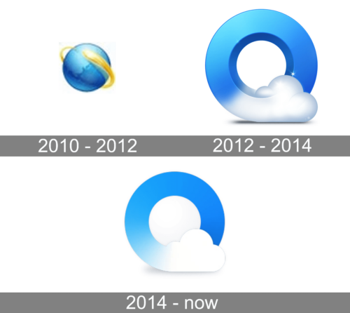
2010 – 2012

A globe with a golden line going around it was the first representation of the new browser. It was supposed to reflect the global reach of the web browser. The golden line going around the globe also showed that information is being exchanged and available everywhere.
2012 – 2014

The new logo was much more creative. They presented a three-dimensional “O” with a blue gradient. The gradient transitioned into a white cloud at the bottom that turned the “O” into “Q”. The designers were able not only to have the initial hidden in the emblem but also present a round shape that reminded of the globe. The blue color also created an association with our blue planet.
2014 – Today

A few modifications were done in 2014 to give the logo a more timeless and sleek. They removed the three-dimensional effect and slightly changed the gradient. At the same time, the amazing idea created a couple of years earlier was preserved.


