QantasLink is an Australian regional airline operating under the Qantas brand. It is owned by Qantas Airways, the country’s largest airline. With its headquarters in Mascot, New South Wales, QantasLink serves as a vital link between regional areas and major cities in Australia. The airline operates an extensive network, connecting over 50 destinations, including popular tourist spots, regional centers, and remote communities. QantasLink is committed to providing safe and reliable air travel, contributing to the economic and social development of the regions it serves.
Meaning and history
QantasLink is an Australian regional airline founded by Qantas Airways Limited in 2002. It operates as a subsidiary of Qantas and provides domestic flights to regional destinations. QantasLink has achieved several milestones, including expanding its route network to over 60 destinations across Australia, serving both major cities and remote areas. The airline has a fleet of turboprop and regional jet aircraft to cater to various regional routes. QantasLink continues to be a prominent regional airline in Australia, offering connectivity to regional communities and supporting tourism and economic development.
What is QantasLink?
QantasLink is an Australian regional airline founded by Qantas Airways Limited in 2002. It operates as a subsidiary of Qantas and provides domestic flights to regional destinations. QantasLink has achieved several milestones, including expanding its route network to over 60 destinations across Australia, serving both major cities and remote areas. The airline has a fleet of turboprop and regional jet aircraft to cater to various regional routes. QantasLink continues to be a prominent regional airline in Australia, offering connectivity to regional communities and supporting tourism and economic development.
2002 – 2007
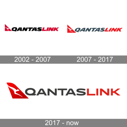
The first QantasLink logo, introduced at the beginning of the 2000s, featured a red, white, and black composition with the corporate Qantas emblem in red and white, and an enlarged uppercase lettering in red and black. The inscription was set in a slanted geometric sans-serif font.
2007 – 2017
The redesign of 2007 has slightly enlarged the triangular emblem, and refined the contours of the inscription, making them smoother and more elegant. The color palette of the wordmark was switched to gray and red, which created a softer mood and a better balance.
2017 – now
In 2017 the contour of the triangular emblem was modernized, and now it looks more like the wing of a plane. It was also enlarged, so the white kangaroo is better visible. As for the lettering, it was also enlarged and switched its typeface to a straight geometric one, with full-chapped capital characters set in dark gray and red.


