Prisma is a Finnish chain of supermarkets, which was established by S-Group Holding and today has 68 locations across Finland, 8 in Estonia and 15 in Russia. The company specializes in selling natural and organic products from more than 30 countries.
Meaning and history
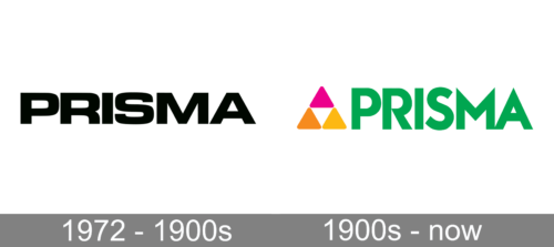
1972 – 1900s
The logo of this chain of supermarkets is a great representation of Scandinavian minimalism and simplicity. It is just the name printed in classic black. The letters have thick strokes, straight cuts, and smooth curves. A very close spacing along with the use of all uppercase letters creates an impression of a solid company. The font used in this version is very close to Microgramma Pro Bold Extended.
1900s – Today
The visual identity of a young developing company is bright and brave. Its logo, composed of a wordmark with a multicolor emblem, is memorable and ideally reflects the essence and profile of the brand.
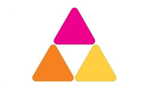
The green bold logotype is accompanied by a geometric emblem on the left, which is also used as the stores’ icon. The emblem is composed of three triangles, with one more in the negative space, forming a big triangle.
This geometric shape is a commonly known symbol of growth and progress. And whit its peak up it also symbolizes stability and seriousness. The three smaller triangles are drawn in different colors — fuchsia, orange and yellow. It is a kind and friendly combination, which evokes a welcoming feeling and represents the company’s value of quality and style, along with the customer as the center of its interests.
The logo of the Finnish chain is modern and fresh. It is a great representative for a young innovative company, with its individual character and attention to detail.
Font
The bold green wordmark in all capitals is executed in a custom sans-serif typeface with pointed peaks and straight neat lines of the letters. The angles of “M” and “A” repeat the triangle and point upwards, showing the innovative and progressive approach of the brand.
The typeface of the inscription is pretty close to Ealing Black, but with some letters modified.
Review
The successful Finnish chain of supermarkets cares about the quality of its products and the convenience of its customers above all. In Prisma stores, you can find a wide variety of natural and organic products, suitable for any diet and need.
The catalog of products includes all the possible categories, such as grocery, fruits and vegetables, dairy products and cheese, bakery, sweets and chocolates, teas and coffees, along with meat, fish and seafood and frozen products. There is also a wide range of ready-made and ready-to-cook foods, as well as kids’ goods, magazines, hygiene and bath items, pet foods and many more.
The company constantly expands its assortment in order to introduce new high-quality world’s brands to its customers and diversify their shopping experience.
Being not a very big chain, Prisma has an opportunity to pay attention to details and make everything for a more comfortable and pleasant purchasing process. There is an opportunity to shop online through the e-commerce platform with a fast and safe delivery across Finland, Russia and Estonia, which is a very popular option.


