 Presbyterian Blue Hose Logo PNG
The nickname “Presbyterian Blue Hose” refers to the athletic teams representing Presbyterian College in Clinton, South Carolina.
Meaning and history

There is nothing but two letters on the Presbyterian Blue Hose logo, the “P” and “C,” which are the initials of the name of the school. From the one hand, this approach provides a more or less clean and not cluttered result. From the other, it may look somewhat generic.
In case of the Presbyterian Blue Hose emblem, the designer tried to make it unique by working on the shape of the letters. We can point out the sharp ends of the “C,” the heavy serifs, and the cut angles on both the letters.
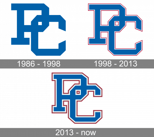
1986 – 1998

The college is called ‘Presbyterian College’, so they simply adopted two letters ‘P’ and ‘C’. The latter was positioned slightly below and to the right of the former, but they were still interlocked. There were no rims, just the color blue throughout the emblem.
1998 – 2013

Outlines were adopted in 1998. There were two layers: white and red – but they treated the two letters as a single image, so there were no outlines that ran through the letters.
2013 – Today

By 2013, they added a grey layer of outline between the white and red. The other two were also made bolder than before.
Presbyterian Blue Hose Colors
BLUE
PANTONE: 286
HEX COLOR: #0060A9;
RGB: (0, 96, 169)
CMYK: (100, 60, 0, 6)
RED
PANTONE: 201
HEX COLOR: #9D2235;
RGB: (154, 34, 53)
CMYK: (7, 100, 68, 32)
WHITE
PANTONE: P 1-1 C
HEX COLOR: #FFFFFF;
RGB: (255, 255, 255)
CMYK: (0, 0, 0, 0)


