

![]() Popsicle Logo PNG
Popsicle Logo PNG
The popular Unilever brand with the name Popsicle, which is known all over the world as “fruit ice”, has an incredibly interesting history of creation. By the example of this brand, you can once again see that everything genius is simple, and many ideas that have changed the world come quite by accident.
Meaning and history
![]()
The Popsicle has its own legend. One winter evening in 1905, his mother made 11-year-old Frank Epperson his favorite fruit cocktail. At that time the following recipe was popular among sweet-toothed people: sugar, a little jam, or jam was added to carbonated water. The contents were well stirred and drunk.
With a glass in his hand, Frank decided to run out to the backyard of a small private house because it was suddenly snowing outside. His mom saw the child half undressed and told him to get dressed immediately. Frank ran into the house, leaving the teaspoon shake on the stair railing. The night was frosty, and in the morning the fizzy water turned into an icy cylinder. And, most importantly, there was a wooden stick stick sticking out of the ice, which Frank used to stir the drink.
Little Frank liked the cold sweet so much that he later began making it on purpose when the temperature dropped below freezing. And almost twenty years later, Epperson began making lemonades, frozen on a wooden stick, for sale. The brand was officially patented in 1923. At first, the ice cream was called “Eppsicle,” in honor of the creator, Epperson. But Frank’s kids called them “Papsicles”. They liked the name so much that it was patented in 1923, but in a slightly modified form: “Popsicle”.
What is Popsicle?
Popsicle is the name of a famous fruit ice dessert, which was invented by an 11yo American boy, Frank Epperson, in 1905, and today it is a popular brand owned by the international giant Unilever through one of its subsidiaries, Good Humor-Breyers.
The color, shape, consistency, product composition, sticks – all of this has changed, updated, and evolved. Whole berries and fruit pieces, caramel, and many other things appeared in the composition of Popsicle. Along with the composition, the visual identity of the brand also changed.
1905 – 1941
![]()
The original Popsicle logo was executed in an intense and quite dramatic color palette, composed of yellow and black. The main element here was the bold stylized lettering, written in thick yellow lines against a plain black background. The inscription in title case characters had elongated lines with sharpened diagonally-cut ends.
1941 – 1969
![]()
The redesign of 1941 significantly changed the Popsicle visual identity. First of all, the new color palette featured a patriotic red, blue, and white tricolor. Secondly, the composition now consisted of diagonal lettering, written on a solid blue background with the “sicle” part inscribed into a solid red circle. This badge became a basis for the iconic Popsicle logo we all know today.
1969 – 1986
![]()
The predecessor of today’s Popsicle badge was introduced in 1969 and stayed with the brand for more than fifteen years. It was a rounded horizontally-stretched banner in blue and red, set against a solid yellow background and outlined in a frame made of solid red circles. The name of the brand was written in bold white sans-serif characters over a blue and red part. The dot above the “I” had a tiny blue spot on it.
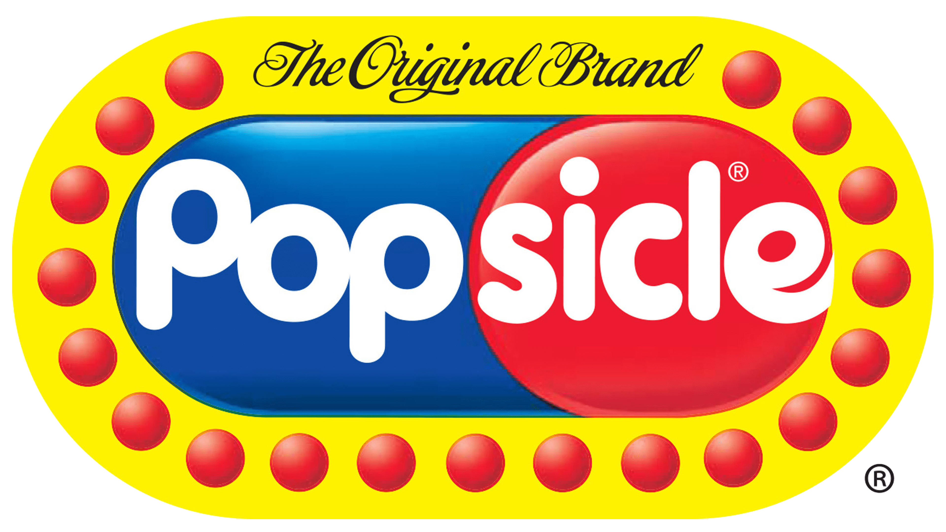
1986 – Today
![]()
The redesign of 1986 has removed yellow from the Popsicle color palette, and now the refined blue and red banner, surrounded by red circles, is placed against a transparent background. The white lettering was also rewritten, using a rounded sans-serif typeface, with the plain white dot above the “I”. The additional lettering in a sophisticated black cursive was added to the top part of the frame.
Font and color
The bold title case lettering from the primary Popsicle logo is set in a rounded sans-serif typeface, which looks pretty close to such commercial fonts as VAG Roundedtrade Next or Futurareg Round SH, but with the modified shapes of the “P”s, removing the upper parts of their vertical bars.
As for the color palette of the Popsicle’s visual identity, it is composed of intense shades of red and blue, with the addition of white, which adds freshness to the powerful combination.


