


 Pinoy Big Brother Logo PNG
Pinoy Big Brother adapted the Dutch Big Brother format for Philippine audiences when it premiered on ABS-CBN on August 21, 2005, with local hosts and housemates carrying the show through its early seasons. It has aired nineteen seasons since, making it the longest-running Big Brother edition anywhere in the world. A 2020 franchise shutdown forced it off free television and into years of cable and streaming deals, setting up a 2025 season built jointly with GMA, ABS-CBN’s biggest competitor.
Meaning and history
Twelve people, strangers to each other, moved into a house on Eugenio Lopez Street in Quezon City the day filming began. Cameras lined every room — twenty-six in total — with microphones tucked into places nobody would notice. Whether Filipino viewers would embrace something this unfamiliar was anyone’s guess, given that nothing like it had aired locally before. They embraced it fast. Ratings for that first episode outpaced every other Big Brother version airing that same year, in any country.
Willie Revillame, Toni Gonzaga, and Mariel Rodriguez ran the show as hosts. Nene Tamayo came out on top by the end, walking off with prizes worth about six million pesos combined. Roughly twenty thousand fans packed into the finale venue in Pampanga. Television audiences ran even higher — close to four million tuned in.
Editions multiplied fast after that. Celebrity edition, February 2006. Teen edition, that April. Regular, celebrity, teen — the franchise kept branching, each strand building its own audience under one shared brand.
The name did work beyond marketing. “Pinoy” is Filipino slang for the country’s own identity, added on purpose to root an imported format in local culture. ABS-CBN built the whole show around “pagpapakatotoo” — staying true to yourself — and branded it “Teleserye ng Totoong Buhay,” a real-life soap opera.
Then 2020 hit. Congress denied ABS-CBN’s franchise renewal. The network went dark on free TV entirely. Pinoy Big Brother kept going anyway, just scattered — Kapamilya Channel, the digital channel A2Z, iWant streaming, even a stretch on rival network TV5 through borrowed blocktime. A season here, a season there, wherever airtime could be found.
2025 brought the real surprise. ABS-CBN and GMA had never worked together on anything, not once. Then came the Celebrity Collab Edition. Bianca Gonzalez led the hosts, joined by two new co-hosts pulled from GMA’s own talent roster. Season 19 followed that October — the first PBB season to actually air on GMA.
2005 — 2005 (Primary); 2006 — 2026 (Secondary)

This blue oval logo opened the franchise and never fully went away. “Pinoy” ran in red across the top. “Big Brother” sat below it in white script, a small black dot splitting the two words, a red-and-yellow swoosh curling underneath the whole thing. It served as the primary mark through 2006. After that it kept turning up on merchandise and archival material for another twenty years, quietly outlasting three or four newer logos in the background.
2007 — 2008

Little changed here. The same blue oval from Season 1 kept running as the primary mark straight through Season 2, no update, no tweak, nothing new. “Pinoy” held its red lettering at the top, “Big Brother” its white script underneath, the swoosh unchanged. Not until the following version did the franchise touch its color scheme at all.
2009 — 2010
Red took over completely here. The oval flipped from blue to a solid red field, “Pinoy” now set in yellow up top, “Big Brother” still in white underneath in that same rounded, dot-divided script. The swoosh stayed too, just recolored to match. Small change on paper. In practice, it was the first time the core mark had ever left its original blue palette.
2011 — 2015
The oval split down the middle for this version — blue on one side, red on the other, no single color dominating anymore. “Pinoy” sat in red, “Big Brother” in yellow. Three sub-brands ran under this identity during its stretch: Unlimited, All In, 737. Title cards varied for each one. The split-oval mark itself stayed the same underneath all three.
2016 — 2017
No oval this time. “PINOY Big Brother” ran as a tight wordmark inside a blue rectangle instead, paired with a small house-shaped icon holding an eye inside it — the clearest nod yet to the show’s whole surveillance premise. This identity landed alongside the franchise’s Lucky 7 season, and it marked a real shift: icon-driven branding instead of the oval logotypes the show had used for a decade.
2018 — 2021
The eye stopped being a small icon and became the entire logo. Blue and red curved shapes formed the outline, meeting in the middle at a plain yellow circle. Nothing else. This was the mark’s first appearance as a standalone symbol, carrying the show through its Otso and Connect editions — and every Pinoy Big Brother logo since has built directly off this shape.
2021 — 2025

Same eye, same blue-and-red halves. This time it got more depth — glossy surfaces, a soft gradient, highlights that catch the light. The flat version before it had none of that. Yellow stayed simple in the center. No rays, no stars, nothing added yet. This carried the show for several seasons before the next redesign layered in more symbolism.
2025 — Today

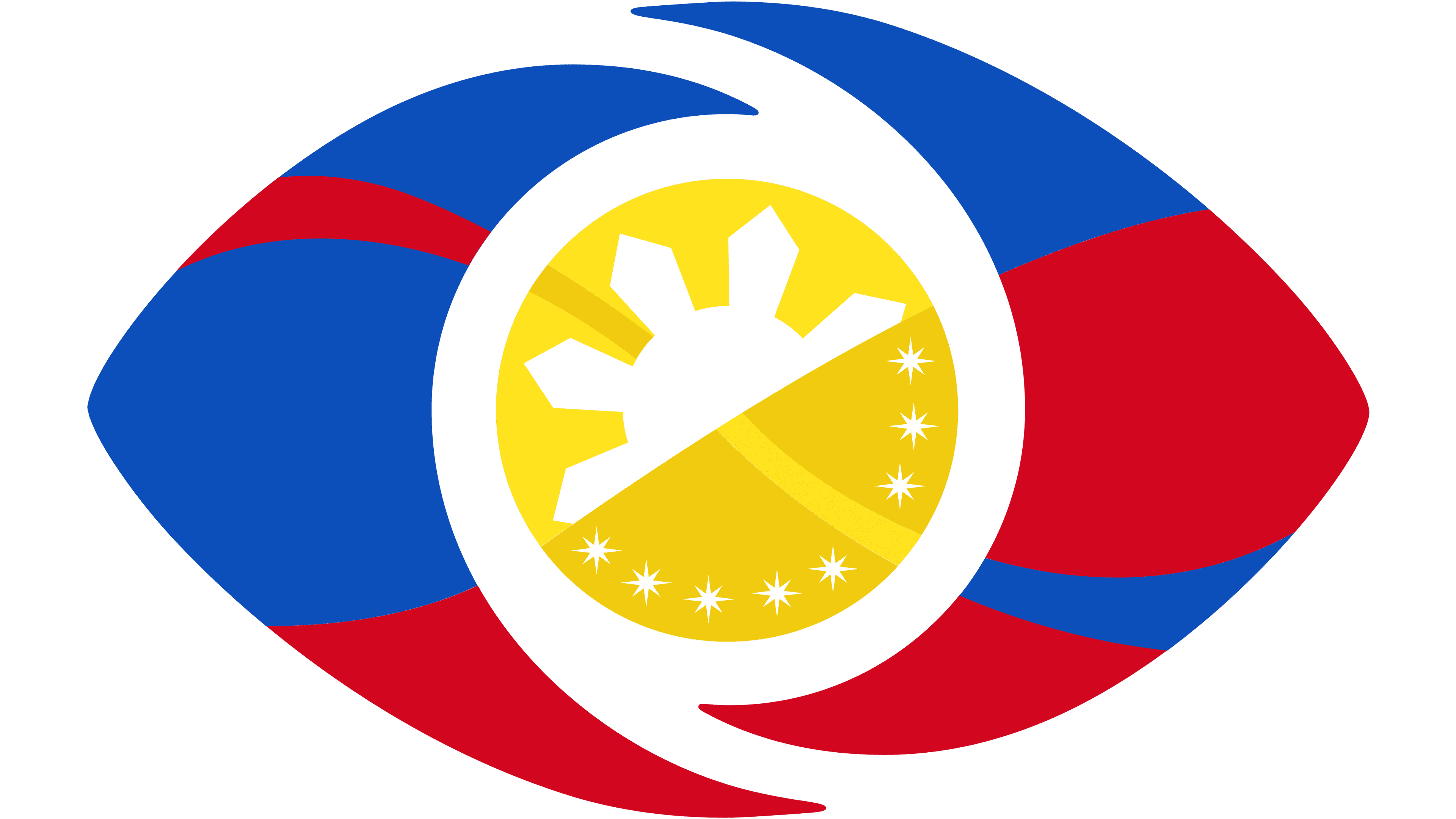
The eye got sharper edges here, and a thin white ring now separates the blue and red halves from the yellow center. Inside that circle sits an eight-ray sun with small stars scattered around it — pulled straight from the Philippine flag. One special variant exists too, built for the Celebrity Collab Edition: the GMA Network and ABS-CBN logos sit on either side of the eye, the first time the two networks’ symbols have ever shared a single piece of branding.
Font and color
No wordmark carries this logo — the eye and its internal details do all the work on their own. Where text shows up elsewhere, on title cards and promotional material, it runs in a modified Trebuchet, thickened up and adjusted specifically for the “Big Brother” name across the franchise’s markets.
Blue and red split the eye shape in half, the same two colors found on the Philippine flag. At the center, a yellow circle holds a white eight-ray sun ringed by small white stars — the flag’s sun-and-stars emblem again, just reworked into a smaller space. Nothing else breaks into the palette.


