As the largest pet products retailer in the United States, PetSmart has more than 1,600 traditional stores in the United States, Canada, and Puerto Rico. In addition, the company is actively developing its online shopping department.
Meaning and history
PetSmart is an American chain of pet supply stores. In addition to retailing well-known global brands, the company also manufactures products under numerous proprietary brands, such as Authority, Dentley’s, Exquisite Cat, Only Natural Pet, and Simply Nourish.
PetSmart was founded in 1989 and is now one of the largest retailers of pet products in North America. The retailer has more than 1,600 retail outlets.
In 2015, the company was valued at $8.7 billion when it was bought by a group of investment funds. The entire U.S. market for pet products and services was valued at $66.75 billion in 2016, according to the industry association APPA.
In 2017, retailer PetSmart agreed to a $3.35 billion deal to acquire online pet products retailer Chewy.com.
What is PetSmart?
PetSmart is the name of the largest chain of pet stores in North America, with more than 1,650 locations. It is also known for its active charity and assistance to animals. If you are planning to buy pet products in the United States, PetSmart is the first store you should look at.
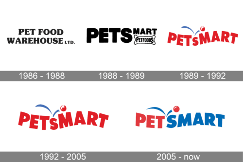
In terms of visual identity, the company has been pretty consistent, with just so trial attempts at logo design in the 1980s, and the version, which became a basis for the current badge, was created already in 1989. Throughout the years, the color palette and the characters’ contours were refined, and today the PetSmart logo looks bright and professional.
1986 – 1988
The original logo of the PetSmart chain was introduced in 1986 and stayed with the company for a couple of years. It was right after the foundation of the company under the name Pet Food Warehouse, and this name was the only element of the badge. It was written in two levels, in the uppercase of a heavy serif font, with the characters set in plain black on a white background.
1988 – 1989
The redesign of 1988 has created a new logo for the company. It was still set in a black-and-white palette but was completely different from the original badge. This logo was composed of a bold uppercase “Pets” in a geometric sans-serif, followed by a small “Mart” underlined by a graphical element, in a shape of a bone, with the narrowed “Petfoods” written over it. This version of the logo was only active for several months.
1989 – 1992
In 1989 the emblem, which is familiar to millions of Americans today appeared. It was a bold red uppercase lettering in a geometric sans-serif font with the “S” smaller than all other letters. The wordmark was written in a horizontal wave, with the red ball jumping above the “S” and leaving blue traces.
1992 – 2005
The playful PetSmart logo was slightly refined in 1992. With the contours of the letters balanced and cleaned up, the shades of both red and blue intensified. The logo started looking more modern and strong.
2005 – Today
The redesign of 2005 has played with the shapes and colors of the PetSmart badge, leaving the “Pet” part red, but writing the “Smart” in blue. The “S” now features the same size as all the other letters, and the ball is slightly moved to the left.
Font and color
The bold and solid lettering from the primary PetSmart logo is set in a modern sans-serif typeface with distinctive contours of the characters and straight cuts of the bars. The closest fonts to the one, used in this insignia, are, probably, Clarika Pro Geometric Ultra, or Phosphate Pro Solid, with some minor modifications of the contours.
As for the color palette of PetSmart’s visual identity, it is based on a bright combination of blue and red; which represents playfulness, and energy, at the same time points to the professionalism and reliability of the company.


