One of the most successful Australian rugby league football teams, the Penrith Panthers have a distinctive logo, which has been modified over five times. In spite of all the alterations, it has remained loyal to its core symbol – an aggressive panther.
Meaning and history
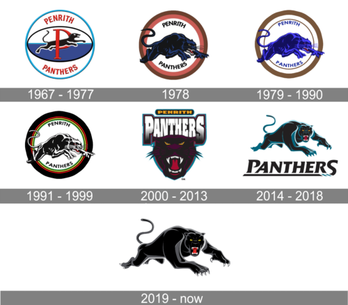
The team was established on July 4, 1966, and admitted to the New South Wales Rugby League competition in 1967.
What is Penrith Panthers?
Penrith Panthers is the name of a professional rugby club from Australia, which was established in western Sydney in 1966. Today it is one of the strongest clubs in the National Rugby League, which has Penrith Stadium as the home arena, and Ivan Cleary as the head coach.
1967 — 1977
The original Penrith Panthers logo showcased a highly stylized panther leaping through a large red “P.” The design was placed inside an ellipse. Above the ellipse, there was the lettering “Penrith,” while the word “Panthers” was placed below the ellipse. The wordmark and the emblem together were housed in a large circle.
1978
The logo introduced in 1978 and used only for a short period gave birth to the logo we all know today. It was an illustration of a daring, feisty animal. The panther was full of strength and determination, just like the club. The black animal with blue highlights was placed in a round frame. However, its legs and tail went beyond it, reflecting the fact that nothing can constrain or stand in the way of this animal. The border was done in brown and muted orange, while the name was printed above and below the panther in a black, sans-serif typeface.
1979 — 1990
The 1979 logo contained fewer details and looked more professional. The panther was now leaner and more fragile. It was a strong creature with sharp teeth and a menacing muzzle. Similar to its predecessor, the panther was leaping, but this time she was facing almost forward, and partly because of this, the leap looked more aggressive – she was going to attack. The panther on the original logo, by contrast, looked as if she was running away.
All the club’s logos were tweaked in accordance with the new palette. The panther was colored in two shades of blue, while the ring around it was brown.
1991 — 1999
The 1991 logo looked almost exactly like the previous one, except for the palette and the rings. It was the first time when the iconic combination of bright rings appeared on the logo.
2000 — 2013
In 2000, a completely new emblem was introduced. There was only the panther’s muzzle now. With its mouth open, the creature showed its sharp fangs, while its bright yellow eyes were half-open. The muzzle was black and purple with a red and teal outline.
2014 — 2018
In 2014, the club returned to the leaping panther, although the logo was completely redrawn. Now, the beast was facing forward, and its head was higher than on the previous “leaping” logo.
2019 — Today

On September 26, 2018, the club unveiled an updated logo. While the shape of the panther and the typeface remained untouched, the color scheme was modified. The club “returned to the ‘liquorice allsorts’ color scheme,” as the press release put it.
Colors
In the early 2000s, the club adopted the color teal and used it for almost 20 years. In advance of the 2017 season, the Panthers returned the palette of their jerseys to the iconic combination of red, yellow, and green stripes, which was synonymous with the team during the 1990s. The updated Penrith Panthers logo announced in 1918 also features the same palette, as well as black and white.


