Pearle Vision is a brand of an eyewear retail company, which was established in 1961 in the USA. Since 2004 the brand is a part of Luxottica Group and is very popular across America.
Meaning and history
 Named after its founder, Stanley Pearle, the brand became synonymous with eye-care.
What is Pearle Vision?
Pearle Vision is the name of an American optics and eye-care brand, which was established in 1961, and today has more than five hundred stores across America and Canada. Since 2004 the brand has been a part of Luxottica, an Italian group of companies, specializing in optics and sunglasses.
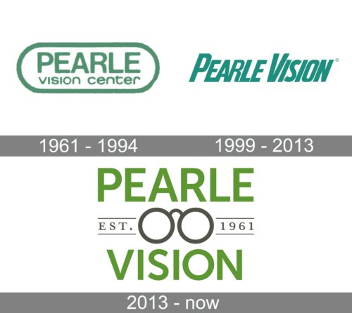
1961 – 1994
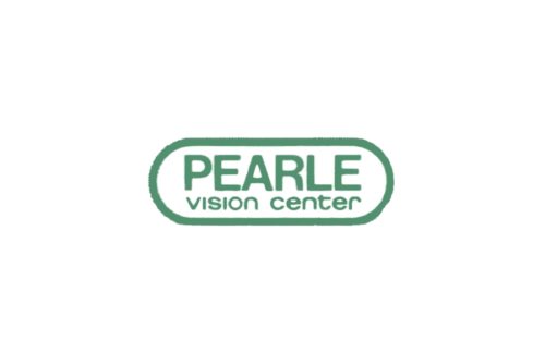
Until 1994, the company used a simple, yet well-designed logo. It consisted of a rectangle with rounded ends base and the name printed inside. The word “Pearle” was done using a larger sans-serif font, while the “Vision Center” part was placed on the second line and reduced to be the same length as the upper line. Both the inscription and the border were done using a calm shade of green. It is often used in the health industry as this color is associated with health, stability, and reliability.
1999 – 2013
The initial visual identity of Pearle Vision was based on a bold and elegant uppercase inscription, executed in an italicized sans-serif typeface with all letters written in strong clean lines and the tail of the “R” smoothly and delicately curved. Both parts of the lettering were written in capitals, though the first letters were significantly enlarged, which added a traditional touch to the whole image. As for the color palette, the original logo of the brand was executed in a dark and intense sea shade of blue, which evoked a calm and relaxing feeling.
2013 – Today
The Pearle Vision logo is composed of a wordmark and an emblem in the middle.
The wordmark in all capital letters is executed in a classic sans-serif typeface with clean strong lines and a good balance between the letters. Above the nameplate, there is an “EST. 1961” inscription, which shows the brand’s value of its history and heritage.
The grass-green color of the nameplate is a symbol of energy and vitality, as well as nature and health. This calm and pleasant color is balanced by the classic gray of the date and the emblem. Gray reflects a stable and reliable company, which is professional and qualified.
The Pearle Vision emblem is placed between the two words of the nameplate and depicts an image of the glasses. Two perfect circles are connected with a thin arched line and show the company’s profile, as well as add harmony to the logo.
The Pearle Vision logo is minimalist yet strong and modern. It uses calm colors and simple clear forms and looks confident. The logo is modest, and it says a lot about the brand and its philosophy.


