Payvision is a European fin-tech company, which was established in 2002. Today the privately held business, headquartered in Amsterdam, provides corporate users from all over the globe with high-quality security solutions for online payments.
Brand Overview
Payvision provides services for e-commerce businesses. Its range of products includes payment methods, fraud management, and SlicePay, which is an automated split payout method.
The company also offers such services as multi-currency transactions, a global processing platform, reports and analysis, and risk management. All the designed solutions correspond to the latest standards and requirements, providing a high level of services and protection.
The list of platform’s tools also includes omnichannel solutions and points of sale settlement, along with global card acquiring. Payvision serves customers internationally and provides consulting and support services 24/7.
Meaning and history
Payvision was created in 2010s as a solution for the hosting of online payment instruments. It was acquired by ING in 2018, which then decided to close down this company in 2021, decision still pending. The platform positions itself as a forward-thinking vanguard of fin-tech solution, hence the name.
Before 2019
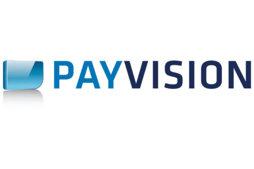
The 2019 logotype incorporates an emblem and a wordmark, located on the left and right respectively. The emblem is a rounded rectangle with a particularly round corner at the bottom right, depicted as a 3D model. It’s colored a regular blue with a lot of lighting and shading on it, as well as a shadow beneath it.
As for the wordmark, it consists of solely capitalized letters and spells out the brand’s name. The font is a typical sans-serif without many distinctive features. A big nuance is that they split the coloring into a darker shade of blue for ‘Pay’ and a lighter one for the rest of the name.
2019 – Today
The service’s visual identity is modern and minimalist. The logo, composed of a wordmark and an emblem, boasts straight lines and laconic shapes, reflecting the strength and progressiveness of the company.
The wordmark in the lover case looks friendly and laconic, and the simple yet contemporary emblem adds a sense of style and professionalism to the whole picture.
The emblem is composed of two stylized letters, “Y” and “V”, which are written in the lowercase and use two colors, light purple, and light blue, which symbolize creativity and imagination, along with reliability and loyalty of the company.
The logotype is written in purple and adds brightness and freshness to the whole image, making the logo recognizable and juicy.
Font
The wordmark is executed in a bold and solid sans-serif typeface, which is pretty close to Pulp Display Medium font, but with “Y” and “V” modified — they are slightly wider and boast more square and masculine contours.
The inscription looks professional and powerful, demonstrating a professional execution and ideal balance of the lettering and evoking a sense of stability and solidness.
Color
The platform has been using different shades of blue since its inception. Earlier, they employed multiple hues on the same very logotype. In the later designs, they’ve switched mostly to purple.


