Palm, Inc. was a US company focusing on making personal digital assistants and various other electronics. One of their products was Palm OS (another name – Garnet OS), a mobile operating system designed for personal digital assistants in 1996.
Meaning and history
Palm, Inc., an innovative company in the field of personal digital assistants (PDAs) and smartphones, was founded in 1992 by Jeff Hawkins, Donna Dubinsky, and Ed Colligan. Beginning as a small venture, Palm quickly rose to prominence with its pioneering work in the handheld computing industry. The company’s early success was largely attributed to the Palm Pilot, released in 1996, which became a hallmark in the realm of PDAs due to its user-friendly interface and efficient operating system. This device set the stage for future advancements in mobile computing.
Throughout the late 1990s and early 2000s, Palm continued to innovate, introducing a series of devices that were not only technologically advanced but also widely accessible to the public. The introduction of Palm OS, a dedicated operating system for PDAs, further cemented Palm’s status as a leader in the field. However, with the advent of smartphones and the increasing competition from companies like Apple and Samsung, Palm began to face significant challenges. The company attempted to reinvent itself with the introduction of the Palm Pre and the webOS operating system in 2009, but these efforts were met with limited success.
Today, Palm’s influence in the smartphone and PDA industry has diminished, overshadowed by larger tech giants. While the company no longer holds the dominant position it once did, its legacy in shaping the early landscape of mobile computing remains significant. Palm’s innovations laid the groundwork for many of the technologies and user interfaces that are now commonplace in smartphones and other handheld devices.
What is Palm?
Palm, Inc. is a once-dominant tech company known for pioneering the personal digital assistant (PDA) and smartphone industries. Its contributions, particularly the Palm Pilot and Palm OS, revolutionized mobile computing, although it has since been overtaken by larger tech firms.
1992
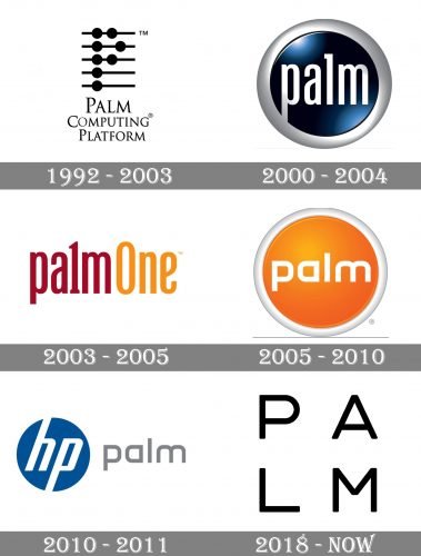
The company was established in 1992 by Jeff Hawkins. The earliest Palm logo reflected the original name, Palm Computing, Inc.
The emblem showcased five horizontal lines with small black circles on them. The top three lines held two circles each, while each of the lower two lines held a single circle. The circles on the second line (from the top) stood further than the circles above and below. As a result, the circles formed a large letter “P.”
A single letter was, of course, not enough to decipher the name of the brand, so the writing “Palm Computing Platform” below was essential.
2000
The company introduced a sleek logo resembling a button. There, the word “Palm” was set in an unpretentious lowercase type. The letters didn’t have serifs, except for the “l.”
The silver writing was placed inside a dark blue circle with “metal” highlights and a 3D gray border.
2003
In the fall of 2003, the hardware division of Palm merged with Handspring and adopted the new name, palmOne, Inc.
The shape of the letters in the wordmark remained the same, except for the “l,” which now looked like the number “1” due to the updated horizontal top. Also, the word “One” appeared in the logo.
The “button” was gone. The palette now included only maroon and orange.
2005
The name “Palm” was adopted once again. Also, the brand returned to the “button” concept of the logo.
Yet, this time, the design looked different. It was now dominated by orange and was slightly flatter. The typeface grew more minimalist.
2010
When Palm was purchased by Hewlett-Packard in 2010, its logo adopted a new structure.
Now, its left part consisted of the emblem of the parent company. To the right, there was the word “Palm.” It featured the same type as the previous emblem but was colored gray and didn’t have the button.
The brand was phased out by Hewlett-Packard in 2011.
2018
HP sold the brand to Wide Progress Global Limited in 2014. Four years later, a new Palm companion device was introduced.
The Palm logo now featured the name of the brand in black capitals. The letters were positioned in two lines forming a sort of square. The type was an austere sans featuring the strokes of a single width.


