The abbreviation “Oxfam” comes from “Oxford Committee for Famine Relief.” The nonprofit group unites 20 independent charitable organizations intending to alleviate global poverty.
Meaning and history
The organization was started in 1942 by a group of Quakers, social activists, and Oxford academics. It was officially registered the following year. Oxfam’s first officially stated aim was to deal with the famine in Greece that resulted from the Nazi occupation.
1900s – 1999

Their long-term logo was their wordmark. These capital letters consisted of turquoise stick-like lines with white gaps and cuts here and there. On either side of the writing, there was a red square.
1999 – 2013
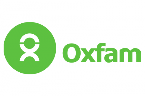
In 1999, the group adopted a green roundel as its symbol. The Oxfam logo has preserved its overall style ever since.
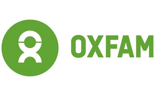
The green roundel houses a white emblem, which can be interpreted in two ways. First, it’s a stylized human figure, the symbol of all those who work for Oxfam and for whom Oxfam works. Also, the emblem is a combination of the letters “o” and “x,” the two first letters of the group’s name.
2013 – Today
The green grew slightly darker. The circle became smaller. Due to this, the white human figure now looks more prominent.
While in the old version, only the first letter of the name was capitalized, in the current one, all the letters are capitals. This makes the brand’s name better legible and also hints at the fact that it’s an abbreviation.
The rebranding was led by Wolff Olins.
Font
The simple and minimalistic sans provides excellent legibility. Yet, it can hardly be called unique or memorable.
Color
Since 1999, the Oxfam logo has always been green. The original color was a little cleaner. The current one looks more natural, closer to the color of the leaves and the grass.


