OshKosh B’gosh is a US children’s apparel company, a subsidiary of Carter’s. It was established in 1895 and is now headquartered in Atlanta, Georgia.
Meaning and history
The history of the OshKosh B’gosh brand began in 1895. A small company in Oshkosh, Wisconsin, initially produced work clothes for local workers, and later – clothes for their children, in particular denim overalls, copying the clothes of their fathers. In 2005, the company merged with Carter’s Corporation.
Denim clothes OshKosh B’gosh is very popular and is considered the best denim clothes for children in the world.
What is an OshKosh B’Gosh?
OshKosh B’Gosh is one of the world’s most famous brands of children’s clothing. it was established in the United States at the end of the 19th century, and today this brand, owned by Carter’s, has its clothes and accessories sold all over the globe.
1895
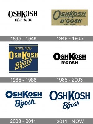
The original OshKosh B’gosh logo was pretty minimalist for its era and we can also add that it seemed to have predicted some of the current logo design trends. In fact, it looked quite innovative for its time.
We can mention, for instance, the way the enlarged “K” showed the border between the two parts of the word replacing the regular space. Or the way the “O” and “K” were slightly larger than all the other letters, although the other letters were also capitalized. On the other hand, the decorative serifs on the top ends of the “H’s,” the “K,” as well as the ends of the “S’s” still reminded that this wordmark had been created more than a century ago.
1949
The design grew simpler and more dynamic. For one, the serifs now looked plainer. Also, the letters were italicized, which added some more implied motion. The way the horizontal bar was positioned below the “K” added a playful touch – the “K” seemed to be stepping over the bar as if the glyph was alive.
1965
The type used for the “OshKosh” part of the wordmark grew simpler. The word “B’gosh,” on the other hand, now featured a more casual, friendly script creating a friendlier impression.
1986
The heavy, bold type made the logo look unapproachable, which hardly benefitted the children’s apparel company.
2003
The brand replaced the “serious” sans serif type in the word “B’gosh” by a playful handwritten script, which made the logo friendlier and better for the younger audience.
2011
The type used for the word “B’gosh” is still a handwritten one but it looks more like the script of the 1965 OshKosh B’gosh logo.
Font and color
The visual identity of Oshkosh B’gosh has two lines of the lettering changed executed in one color but different typefaces. The main inscription, “Oshkosh” is written in a bold rounded sans-serif font, which is similar to Haboro Soft Condensed Extra Bold and Zelda SmallCaps Up Bold, with the angles of its thick lines slightly rounded.
The “B’gosh” part of the nameplate is set slightly diagonally and uses a custom handwritten font, something in between Kobryan Regular and Hoffers Regular, which looks welcoming and friendly.
The color palette of the Oshkosh B’gosh visual identity is composed of dark blue and white, which is a combination of symbolizing high quality, timelessness, and professionalism. The white accents of the logo represent transparency and elegance.


