Nutella is an iconic Italian brand of a chocolate-hazelnut spread. It was established in 1963 and today is the label of one of the most famous chocolate manufacturing groups — Ferrero.
Meaning and history
The history of the brand can be traced back to 1946 when Pietro Ferrero, an owner of a bakery in Alba, sold his first 300 kilograms batch of Pasta Gianduja. Five years later, he introduced a creamy version under the name of Supercrema gianduja.
What is Nutella?
Nutella is the name of an Italian brand of a hazelnut and cocoa spread, which has been produced since 1964. Today the brand is owned by one of the largest European confectionery companies, Ferrero SpA, and has its spread distributed all over the globe.
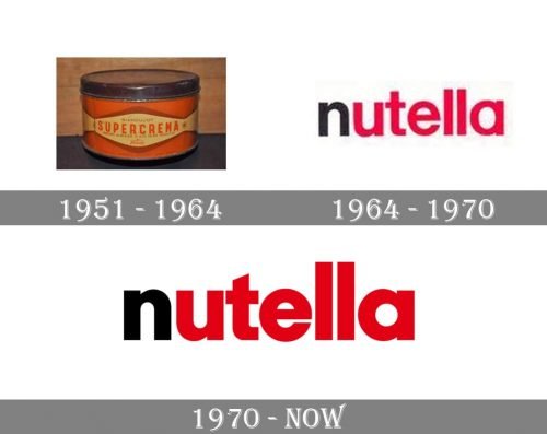
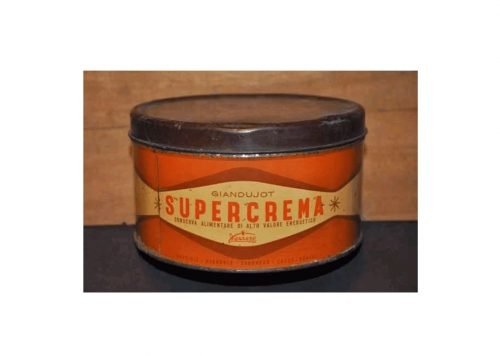
1951 (Giandujot Supercrema)
The Supercrema was sold in glass jars with an ivory label. The label featured the word “Supercrema” in orange with the lettering “Giandujot” in a smaller and lighter type above. The logo of the parent company, Ferrero, could be seen below.
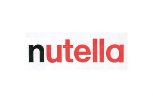
1964 (Nutella)
When the company decided to sell the product throughout Europe in 1963, it changed the name to “Nutella” and modified the recipe.
The Nutella logo looked nothing like its predecessor. It was simpler yet more memorable and professional. The design forces behind the brand opted for the wordmark where the initial was black, while all the other letters were maroon. The name of the brand was given in lowercase letters. The type was a minimalist and perfectly legible sans.
It was not the font but the approach to the color scheme that made the design look fresh and distinctive.
1970
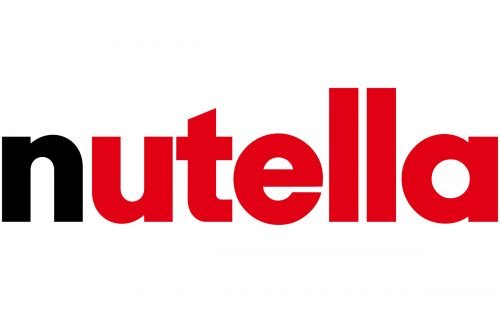
The difference between the previous logo and its modification was so subtle that many customers probably did not notice it at all.
Yet, if you compare the two versions side by side, you can see the alterations clearly. For one, the type has grown slightly bolder. The boldness of the letters brings to mind the sweet chocolate flavor you get from a thick layer of the spread. The heavier glyphs seem to be better visible at larger distances.
The new color, bright red, also makes the wordmark better visible and more eye-catching.
In addition to this, you may notice the “t” has grown smaller in comparison with the double “l,” while its top end has been cut diagonally. This adds some dynamism to the design (the eye travels from the lower initial, the “n,” to the higher “t” and then to the double “l”).
Font and color
The lowercase Nutella logotype from the primary badge of the brand is executed in an extra-bold sans-serif typeface with stable solid letters and clean lines of the contours. The closest font to the one used in the Nutella insignia is, probably, Neue Singular H Black, but with the vertical bar of the letter “T” cut diagonally.
As for the color palette of the Nutella visual identity, it uses two shades — black and red, and is usually set against a white background, making up the most classic and traditional tricolor in the logo design world.


