The logo of the Finnish food brand Fazer hardly gives us a hint about the type of company it belongs to. And yet, the pronounced handwritten influence adds a warm “homemade” touch. It brings to mind the recipe books where the recipes are written by hand.
Meaning and history
The history of the largest Finnish food company started in 1891 when Karl Fazer opened a “French-Russian confectionery” in Helsinki.
1891 – 2006
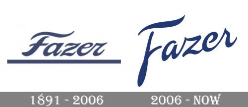
 The old Fazer logo was somewhat similar in its overall style to the current one. While the letters looked as if they had been written by hand, there were no links between them, except for the “e” and “r.” Below the lettering, there was a rather thick horizontal line.
2006 – Present
The wordmark was rotated so now it has upward dynamics. The glyphs look more casual and are connected. In other words, the influence of the handwriting style has grown more pronounced.
The name of the brand can be given either on its own or inside a circle, paired with a swoosh.
The Fazer logo features a dark shade of blue. While it is neither very distinctive nor meaningful but provides enough contrast and gives a chance to use the wordmark with inverted colors.


