NSU was a German automaker initially founded to produce knitting machines in 1873. It later transitioned to building bicycles, motorcycles, and eventually cars. Now, it’s part of the Volkswagen Group under the Audi brand. The company is headquartered in Neckarsulm, Germany, and historically it was a pioneer in the automotive industry. NSU is particularly remembered for its revolutionary rotary engine designs and the production of the world’s first mass-produced car with a rotary engine, the NSU Ro 80.
Meaning and history
NSU was founded in 1873 by Christian Schmidt and Heinrich Stoll as a manufacturer of knitting machines. Over time, the company transitioned into making bicycles, motorcycles, and cars, becoming a notable name in the automotive industry. One of its remarkable achievements was the introduction of the NSU Ro 80 in 1967, which was the first mass-produced car with a Wankel rotary engine. The vehicle received the Car of the Year award in 1968. NSU was also involved in motorsport, securing several world records and championships in motorcycle racing. The company was eventually acquired by Volkswagen Group in 1969 and merged with Auto Union to form Audi NSU Auto Union AG, now simply known as Audi. Today, the legacy of NSU is part of Audi’s rich history, and the brand no longer exists as a separate entity.
What is NSU?
NSU was a German automotive manufacturer that initially started as a producer of knitting machines in 1873. It later ventured into bicycles, motorcycles, and cars. The company was known for its innovative engineering, including the world’s first mass-produced car with a rotary engine, the NSU Ro 80. It’s now part of Audi under the Volkswagen Group.
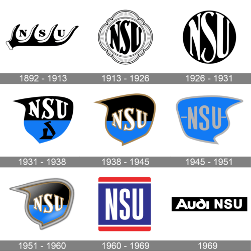
1892 – 1913
The logo of the brand had a deer antler serve as a base. It held the three initials of the name between each antler branching. The name was printed using a serif font with high-contrast strokes. The black and white color palette of the logo made it look professional and solid, while the antlers added a sophisticated and grand touch.
1913 – 1926
The new logo of the brand looked compact and ornate thanks to a decorative border around the round emblem. Its symmetrical design created a feeling of perfection. The name was printed using a different font, but it still featured serifs. Actually, it seemed that the previous inscription was simply adjusted to fit and fill the round shape.
1926 – 1931
This logo has a lot in common with the previous emblem. In fact, the company simply removed the decorative frame around the circle. The colors were inverted, which allowed the emblem to stand out even on a white background. The white lettering looked well against such a background. The logo also featured more refined serif and slightly adjusted strokes, making the inscription look even better. The minimalistic design of this logo would never let you guess it was created around a century ago. At the same time, the border left around the characters seems to be too thin, making one desire to add another thin line as a border or to make the inscriptions slightly smaller.
1931 – 1938
The updated logo looks very different from earlier versions. It has an abstract shape with rounded lines and two pointed ends that have a feeling of movement and style. The shape was split in half horizontally with sky blue bottom half and black top. The name was still printed using a font very similar to the previous one but with a few adjustments to better fit the new look. The blue portion featured another abstract line that created a character similar to the letter “D”.
1938 – 1945
The logo was slightly revised a few years later. The name was now centered. In addition, the abstract shape as well as the inscription had a golden outline, which surprisingly looked very nice with existing colors. This version looks sophisticated and makes the brand appear well-established and trustworthy.
1945 – 1951
The light blue color from the previous emblem now filled the whole shape, which looked like a redrawn inverted version of the previous one. The font was also simplified as there were no more serifs and a solid light gray shading. At the same time, the designers kept the pattern with the middle letter being larger than the other two. The outline was also done in a light gray color to match the inscription. Besides two dashes on either side of the name, there were no other elements in this logo.
1951 – 1960
The company brought back the logo it had designed in 1938. There were no changes, except for the addition of a voluminous light gray outline and the addition of light in the upper left corner that created a gradient on the black portion of the logo. It was used for almost ten years more.
1960 – 1969
This logo looks nothing like the previous versions. It features a dark blue rectangular base with a thin white line followed by a thicker red line framing it above and below. The red line is rounded to create a smoother look that would remind of fluent shapes it had earlier. The brand name is printed in white across the blue portion of the base, which creates a very eye-pleasing contrast. The geometric, sans-serif font with bold strokes looked solid and powerful.
1969
This logo corresponds to the time when the brand was acquired by Volkswagen and became part of the Audi NSU Auto Union AG. It features a black rectangular base that gives it a solid and professional look with white lettering. To the left, the logo has “Audi” printed using a font used in Audi logos, and to the right, it has “NSU” printed using a simple, sans-serif font with clean lines and straight cuts. It was a perfect transitioning logo.


