Nivea was established in the spring of 1882. Today, the German personal care brand belongs to the Hamburg-based company Beiersdorf Global AG.
Meaning and history
The history of the Nivea brand began in 1890 in Hamburg, when Dr. Oskar Troplowitz bought the laboratory of Paul Beiersdorf, which was called after his last name, Beiersdorf. The world’s first moisturizing cream was introduced by Nivea in 1911. Despite its century-long history, its composition has changed little and is almostthe same in production to this day.
By 1914, the company was operating in 14 countries around the world. At the same time, its production was not only in Germany, about 42% of all brand products were created abroad. There was also a famous symbolic combination of colors, symbolizing the brand: white and dark blue, with the inscription Nivea – which made the company even more recognizable.
What is Nivea?
Nivea is the name of an iconic cosmetic brand, which was established at the end of the 19th century in Germany and became the company, which invented a facial crème. The first Nivea crème was introduced in 1911, and by today its recipe has remained almost unchanged.
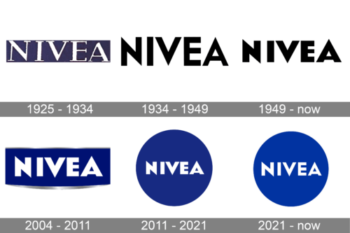
1925 – 1934
1934 – 1949

The initial Nivea logo, designed in 1934, featured a sharp and clean black logotype in the uppercase, executed in a modern geometric sans-serif typeface, with neat straight contours and pointed angles. The diagonal lines played the most important role in the inscription, creating a mood full of confidence, strength, and determination. It was a simple insignia, though became a basis for all the future logo designs of the famous cosmetic brand.
1949 – Today
 The Nivea logo already features the angular type familiar from the current logo. The tops of two letters, “A” and “N,” are higher than those of all the other glyphs. While there is a black-and-white logo, you can also come across versions featuring various combinations of the iconic Nivea blue and white.
2004 – 2011
In addition to the logos mentioned above, the brand introduced a version with silver trim.
2011 – Today
A roundel logo was added. Here, the word “Nivea” in the heritage type was placed inside a circle filled with the familiar dark blue shade.
2021 – Today
The redesign of 2021 hasn’t brought anything new to the Nivea visual identity, only refined and refreshed the contours and the color palette of the iconic badge, making it look “younger” and adding some dynamics to the overall composition. The solid blue circle became a bit lighter and brighter, the new shade created a great contrast with the straight and sharp white lettering, set in the middle of the circle. The typeface of the inscription got refined too, and now looks more like the one from the very first Nivea logo — with thinner bars, distinct edges, and very sharp corners.
Font and color
The iconic Nivea logotype, refreshed in 2011, is written in all capitals of a geometric sans-serif typeface with sharp praxis and clean contours of the massive letters. Slightly elongated lines and triangular edges are what make the wordmark instantly recognizable across the globe. The typeface, Nivea uses for its visual identity, is pretty close to such fonts as Eagle, Bovine MVB, and Resolute NF.
The blue and white color palette, which was chosen by the brand in the 1940s, makes the simple geometry of its composition shine bright. Solid white letters on a bright blue background represent the professionalism of the brand, high quality of its product, and reliability. The color scheme also evokes a sense of trustworthiness and comfort.


