The earliest Nikon logo, which was unveiled in 1917, included not only the word “Nikko” (that was the company’s name back then), but also its translation into Japanese. This was done in order to reflect the company’s roots. Since then, the wordmark has gone through a long series of modifications.
Meaning and history
The visual identity of the legendary photo cameras manufacturer has a long and intense history — there were more than five redesigns held by the brand since the very first logo was launched in 1917.
The company was established as Nippon Kogaku, and only got its current name in the 1950s, so the first two versions of the brand’s logo were built around its original name and Japanese legacy.
1917 — 1930
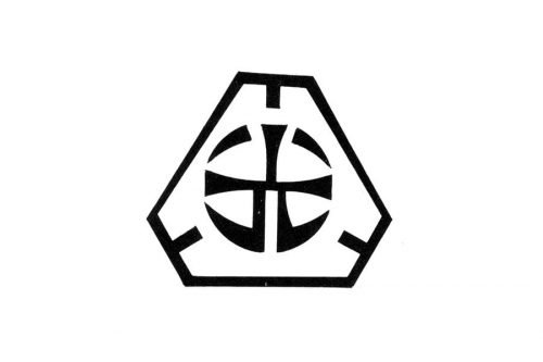
The very first Nikon logo was an abstract symbol, enclosed in a hexagon, and executed in monochrome. It was a circular figure formed by several lines resembling a hieroglyph, which was a celebration of the company’s roots and heritage.
As for the main shape, it was a graphical representation of the lens, reflecting the company’s nature and essence.
1930 — 1949
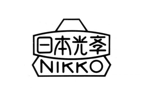
The “Nikko” wordmark and its Japanese equivalent were two parts of the new emblem, created in the 1939s. It was a white geometric badge with black lettering and outlines, where the hieroglyphic part was placed inside a rectangle with its upper and bottom sides slightly arched from the center. The Japanese nameplate was located over a hexagon, replicating the original logo, and the “Nikko” in capitals was written on its bottom part.
1949 — 1953
The shape remained the same, but the wordmark was changed in 1949. Now the hieroglyphs were replaced by the “Nippon Kogaku” inscription, and the “Nikko” was changed to “Tokyo”. Same lines, same colors, same style.
1953 — 1979
The name of the company was changed to Nikon in 1953 and the first logo with the new wordmark was designed in the same year. It was a simple black logotype, executed in a bold italicized sans-serif. Elegant and strict, showing the professional company and its progressive approach.
1965 — 1979
The first colorful version of the logo was introduced in 1965z the same wordmark was now placed inside the horizontal yellow oval with a thick black outline. The Track Nikon emblem was designed by Yusaku Kamekura and became a prototype for the logo we all know today.
1979 — Today
The new logotype was created in 1979 and still can be seen on the company’s products. It is still executed in an italicized sans-serif, but with longer lines, which make the whole look more balanced and solid.
1988 — 2003
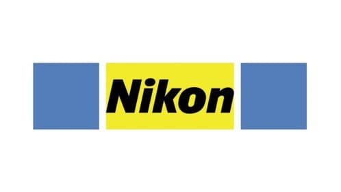
In 1988 the company decides to come back to the color palette of 1965, adding sky blue shade. The signature black wordmark is now placed inside the long horizontal rectangle, with its middle part in yellow and left and right part in sky blue, with thick white verticals, separating them one from another.
2003 — Today
The redesign of 2003 brought the new look to the company and became an iconic and recognizable symbol of high-quality photography, which is still used by the company today.
The black “Nikon” inscription is placed on the bottom part of the yellow square with a striped pattern, created by several lines of gradient yellow and white shades.
The logo looks fresh, friendly, and bright, reflecting the character of the company and showing the customer as the center of its interests.
Font
The current Nikon logo features a customized sans-serif type, which is slightly italicized.
Color
The color scheme includes a bright, crisp hue of yellow, symbolizing youthfulness and energy, and black, representing such concepts as “high quality” and “elegance”.


